Punsara WijetungaCV
← Back to work
B2B SaaSCommunicationsWebRole-Based Access

Enterprise Messaging & Campaign Platform

A Sri Lankan bulk SMS provider was paying a high price for a campaign system built for another country. It was hard to use, didn't fit how Sri Lankan clients run their campaigns, and didn't break down what a campaign would cost. The provider wanted a local replacement, built around its own requirements, for both its staff and the VIP clients who run campaigns themselves.

Role
Sole Product Designer: requirements, end-to-end design, design system and developer handoff
Project type
Client Project
Timeline
9 months (January to September 2024)
Outcome
Fully built and ready for launch; launch paused when the client exited the market
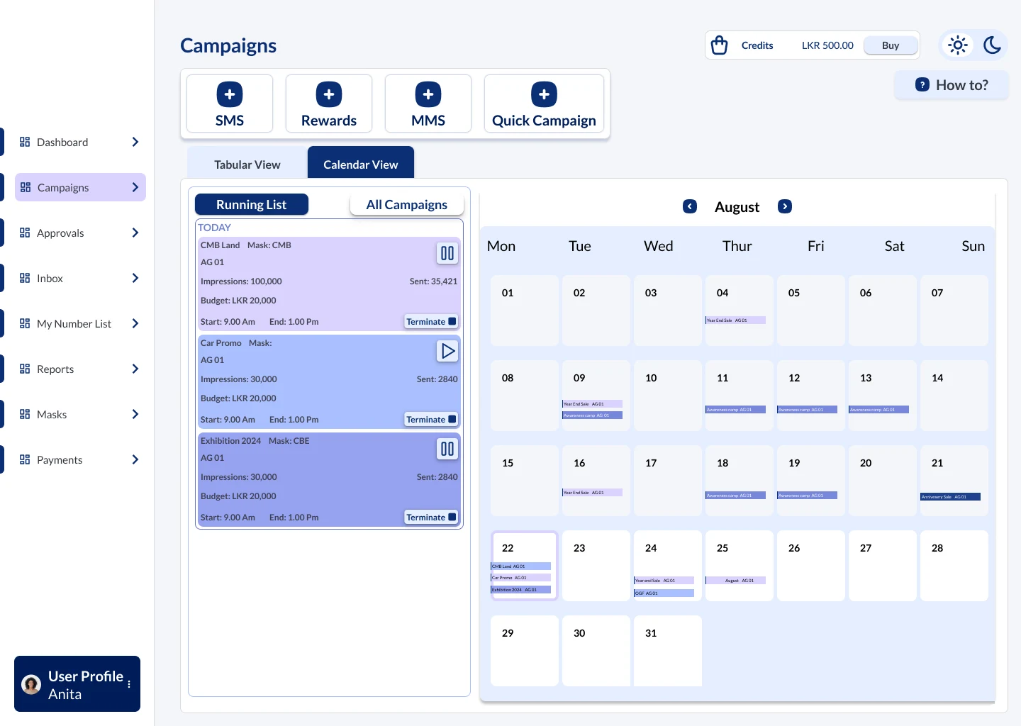
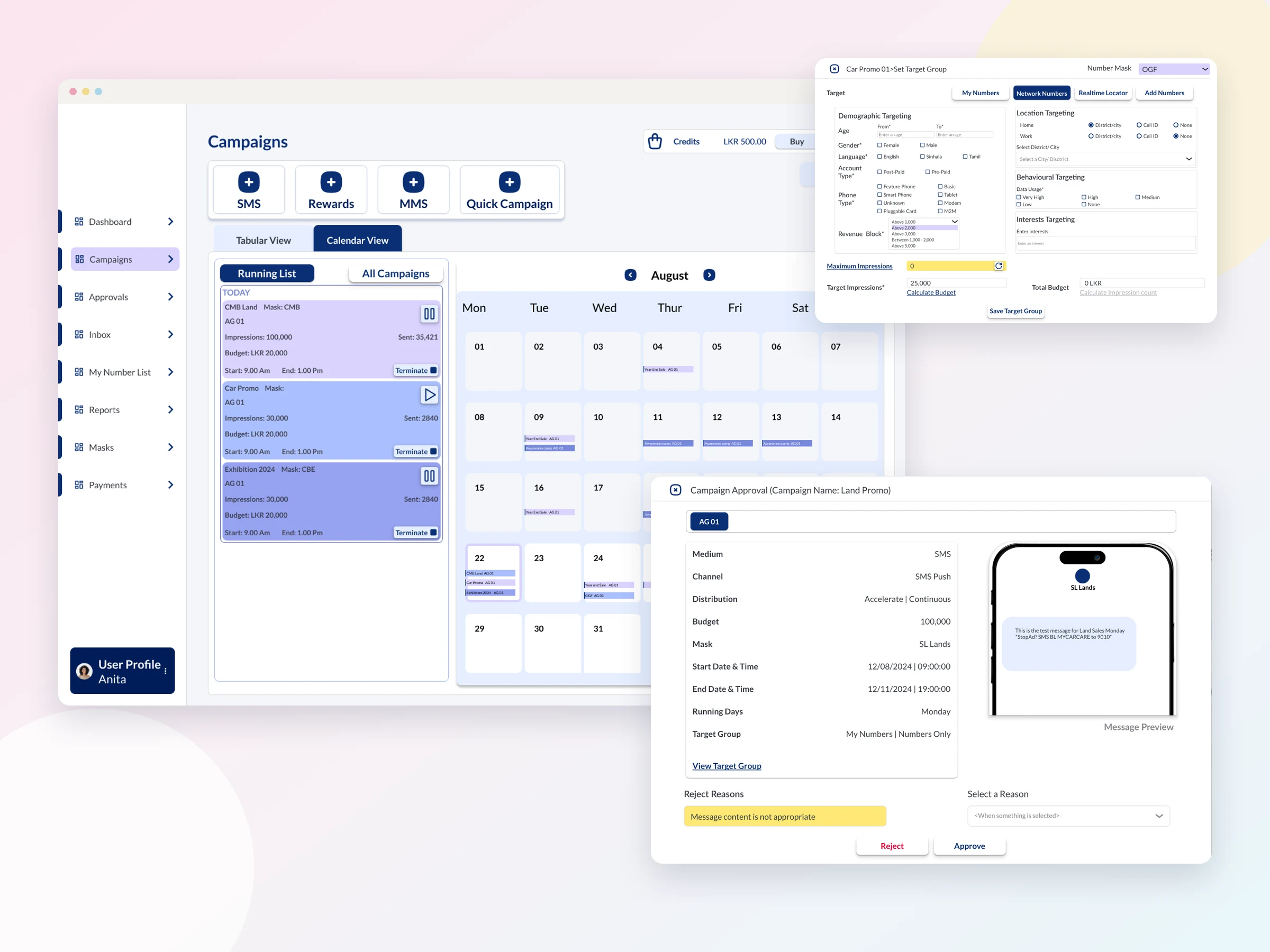
The campaign calendar, the Network Numbers targeting panel and a campaign approval window with a message preview
4Audience sources in one targeting panel
9Campaign statuses, each with its own label
~140Components in the handoff design system

01 — Discovery

Designing from a single sentence

Businesses come to the provider to reach large audiences by text: a retailer announcing a sale, a brand opening a new branch, a political group campaigning before an election. Every campaign needs a message and a sender name, the "number mask" recipients see instead of a phone number. The audience can be the client's own customer list, or new people across the provider's affiliated mobile networks, filtered by location and interests without the client ever seeing those numbers. Clients pay by reach, frequency and message length.

Campaigns arrive in two ways. Most clients hand their message and audience to the provider, and its staff set the campaign up for them. VIP clients log in to a self-service portal, buy credits and run their own.

I never had direct access to the client, who stayed anonymous throughout. Requirements came through a third-party business analyst, as written documents and one-to-one interviews, and finished designs were reviewed in anonymous online meetings the analyst set up. The brief for the messaging flow itself was one written sentence. Bulk messaging was also new to me, so I learned the domain as I designed.

Seven insights shaped the product. Every message needs a sign-off, but not from the same place. One campaign often means several messages for different audiences or days. Audiences come from very different sources, each needing different inputs. Everyone needs to understand the cost before committing. Repeat clients send similar messages, and retyping them caused mistakes. Staff had no sense of what still needed completing, or where a submitted campaign stood. And staff work in long sessions, so visual comfort mattered as much as speed.

02 — Users & Roles

Every message has a sign-off, but not from the same place

The provider ran several internal business units, such as marketing campaigns, political messaging and a high-volume district, and each needed a different level of control over what went out. VIP clients needed their own accounts on top of that. My first design had no approval step at all; once the need for sign-offs became clear, I rebuilt the role model around it, working it through with the backend developer until it was both true to the business and realistic to build.

  • Main AdminRegisters each business unit and sets up its system adminAccess: Chooses each system admin's permissions with checkboxes
  • System Admin (three types)Sets up departments and users within their unitAccess: Type 01: setup only. Type 02: can also approve. Type 03: can approve and create
  • InputterCreates campaigns: sender name, message, audience and scheduleAccess: Submits campaigns for approval
  • ApproverReviews campaigns before they go outAccess: Approves, or rejects with a preset reason and a note
  • Inputter-approverFor departments trusted to sign off on their own messagesAccess: Creates and approves their own campaigns
  • VIP clientRuns their own campaigns through the self-service portalAccess: Credits wallet, optional sub-accounts; some accounts need the provider's final approval

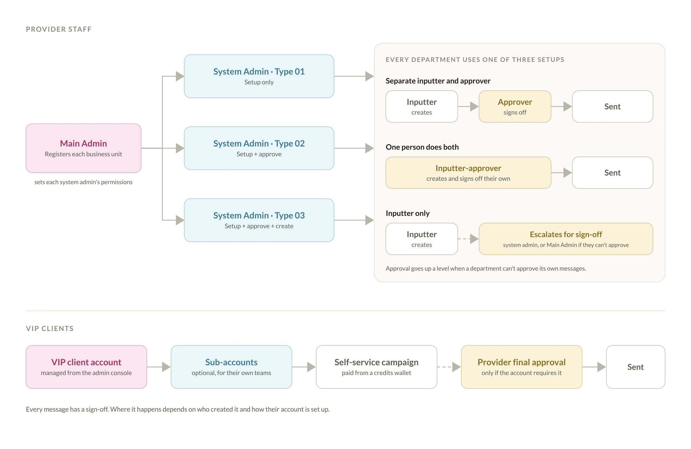
Each department is set up in one of three ways: a separate inputter and approver, one person doing both, or inputter only. An inputter-only department's messages escalate to its system admin for sign-off, or to the Main Admin if the system admin can't approve either.

Diagram: the Main Admin sets up three types of system admin; every department uses one of three setups (separate inputter and approver, one person doing both, or inputter only with escalation); VIP client accounts, optional sub-accounts and an optional provider final approval
The role and approval model, redrawn: one permission system for every business unit and client account.
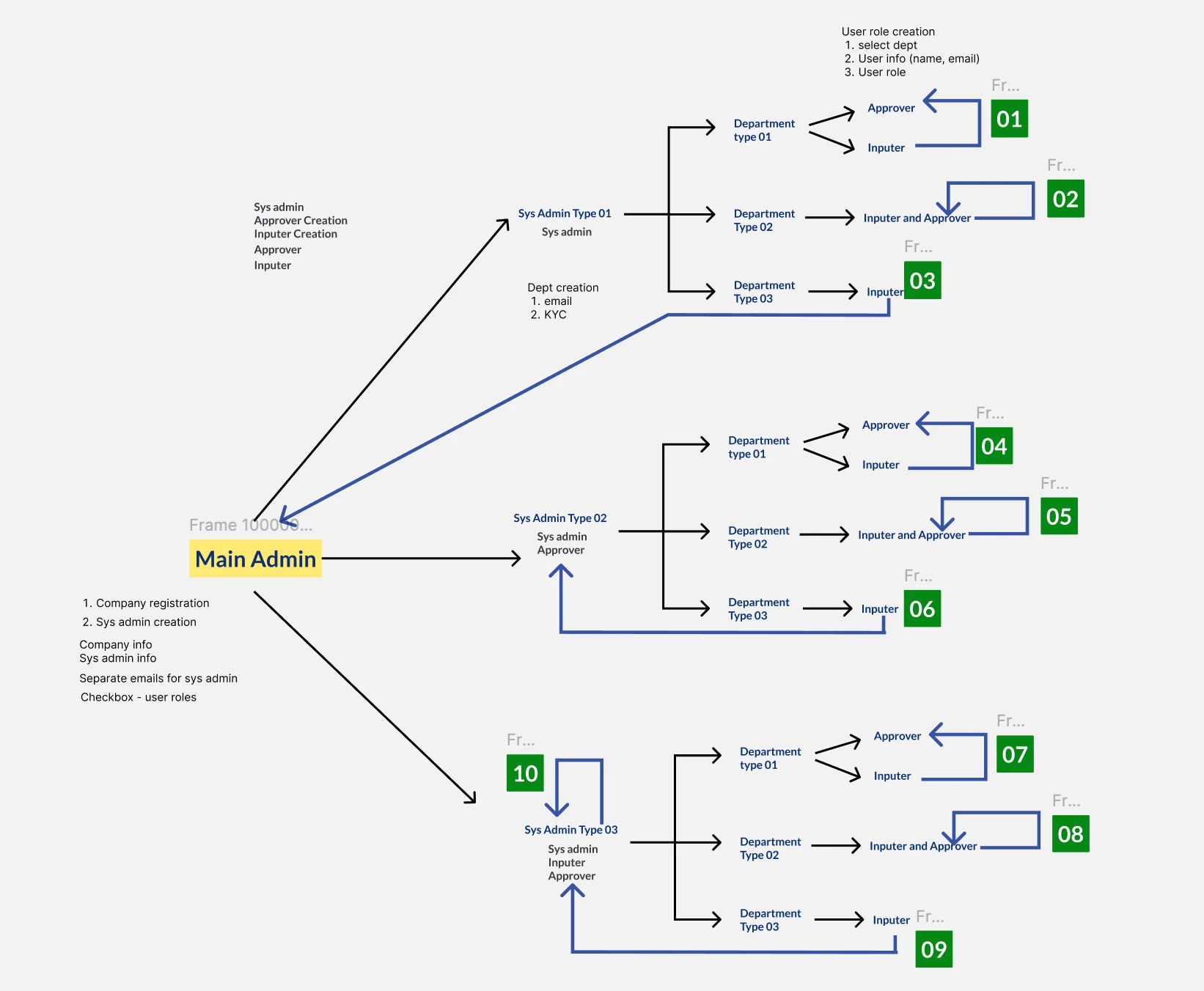
Working diagram in Figma: the Main Admin branching to three system admin types, each with numbered department flows for approver, inputter and inputter-approver paths
The working version I mapped with the backend developer, numbering every approval path.
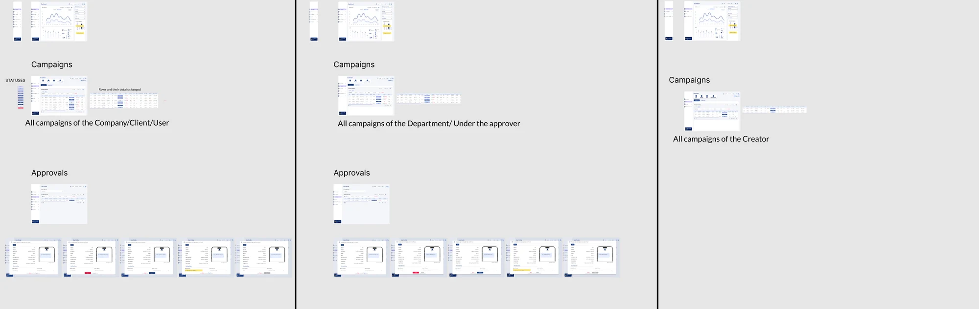
Role-based views board comparing what the system admin, approver and inputter see in their dashboard, campaigns and approvals
What each role sees: all campaigns of the company, of the department, or only the creator's own.

03 — Wireframing & Testing

Two portals, one campaign flow

The product has two parts. The user portal, for provider staff and VIP clients, holds a dashboard of reach, impressions and spend; campaigns in table and calendar views; a quick campaign path; approvals, shown only to approver and admin-level users; saved number lists and templates; an inbox; and a credits wallet in the top bar. The admin console gives the provider campaign approvals, client and admin accounts, users, policies, rate cards and reports, including delivery status reports.

A campaign is made up of one or more ad groups, each with its own message, target group and schedule, so one campaign can send different messages to different audiences at different times. The message composer covers channel (SMS, Push or MMS), language and sender name, with a live character counter and an opt-out line added automatically. Scheduling covers dates, running days, time belts, repeats and a delivery method: even, accelerated or continuous.

The design ran through several dated rounds of redesign: internal review with senior management and the dev team, then client review through the analyst. My first campaign form was a step-by-step flow with a progress bar, which the client didn't want. I redesigned it as a single screen with every section visible; each section opens its own popup as you fill it in, and "Send for approval" only becomes active once every required section is complete, which shows progress without a progress bar. I also explored a dark theme, but the client chose a single light theme for long working sessions.

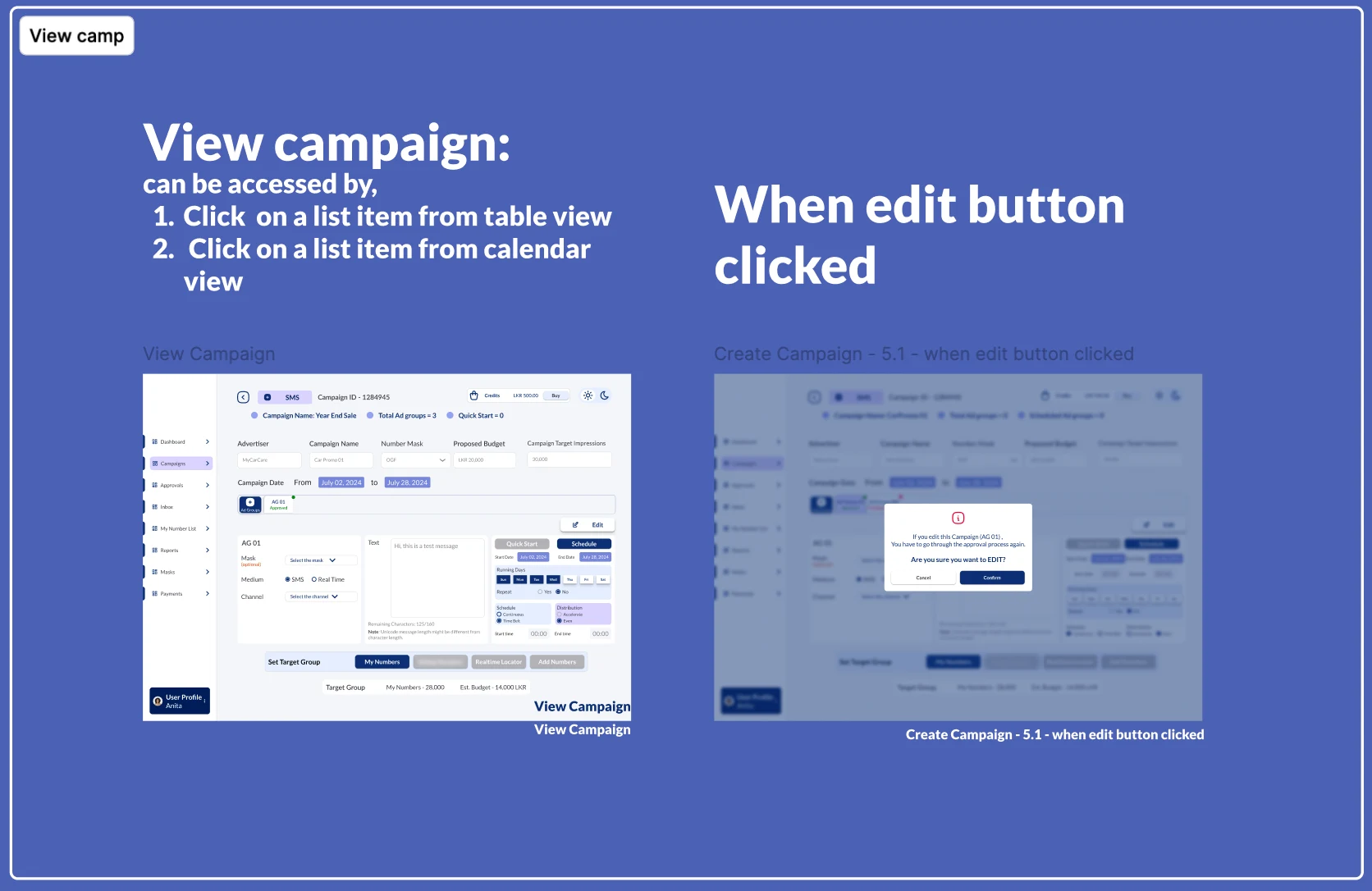
Annotated board: the single-screen campaign view, reached from the table or calendar, and the warning shown when editing sends the campaign back through approval
An annotated board from the handoff file: the single-screen campaign view, and the warning that editing sends a campaign back through approval.

04 — Key Design Decisions

Three decisions that shaped the product

With no direct line to the client and a thin brief, the hardest problems were structural: who signs off what, where an audience comes from, and how to make cost visible before anyone commits.

Decision 1

A flexible approval structure developers could build

The problem

My first design was simple: create a message and it sends at the set time. The client needed sign-offs, and different units and client accounts needed them in different places, depending on their size and level of trust.

The solution

I worked through the model over several days of discussion with the backend developer, aiming for a structure that matched real-world needs and was realistic to build, rather than one that only looked good on screen. We agreed on three system admin types, three department setups, and automatic escalation when a department has no approver of its own. VIP client accounts fit into the same model, with an optional final approval from the provider.

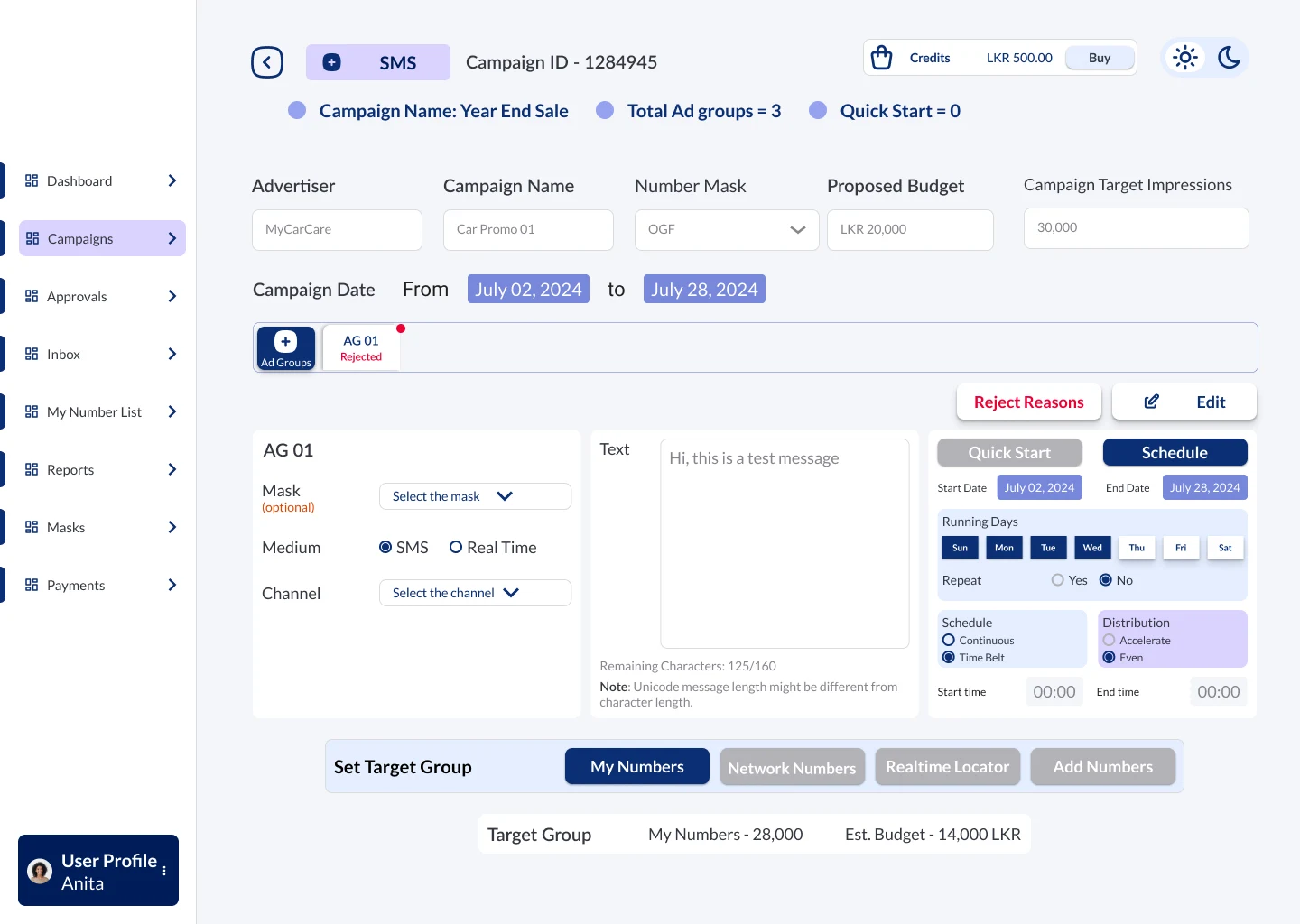
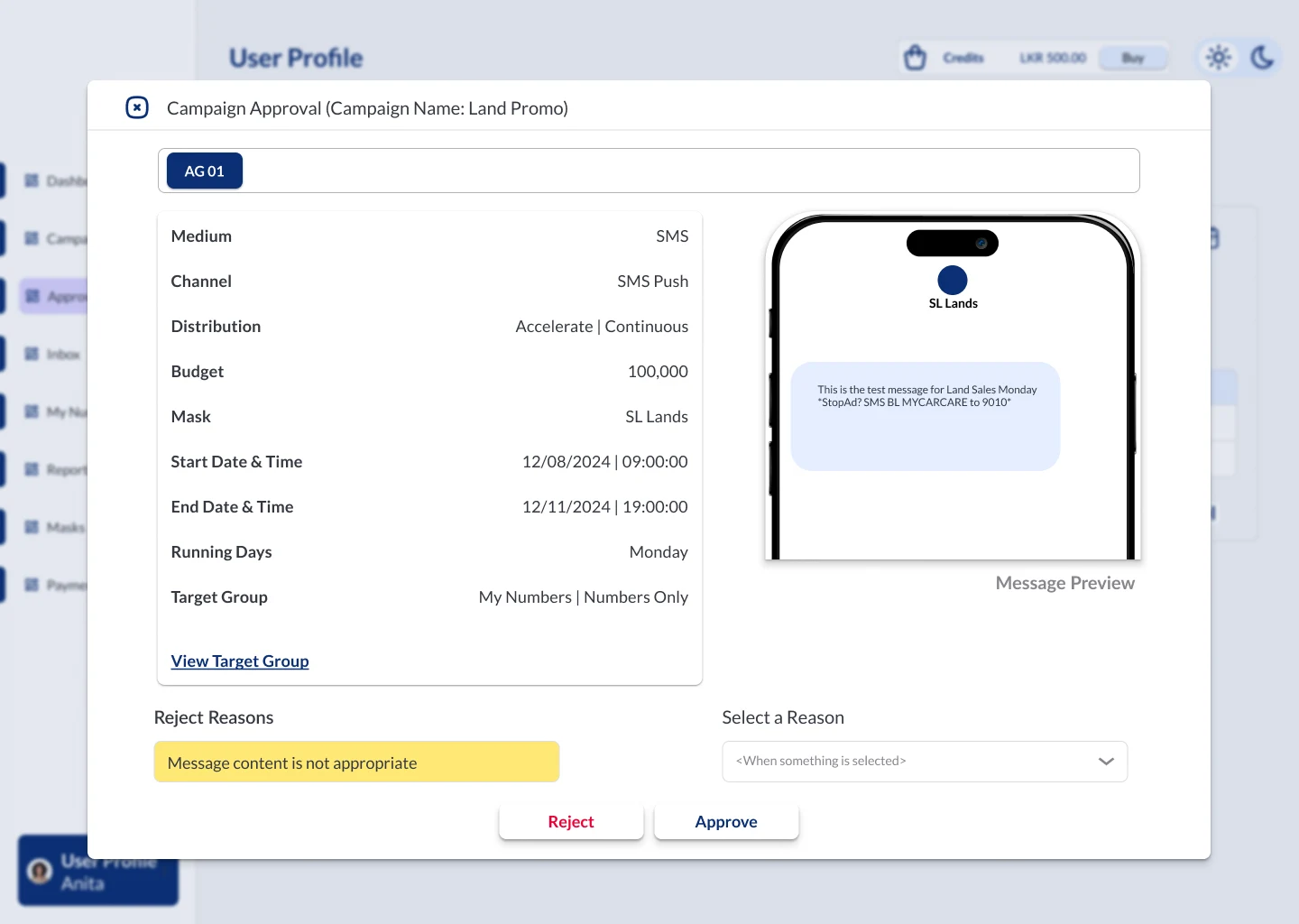
On screen, approvers review each ad group with a live message preview, then approve, or reject by picking a preset reason such as "Message content is not appropriate" and adding a note. A rejected campaign goes back to its creator showing the reason and note, ready to fix and resubmit. Every campaign carries one of nine statuses, from Incomplete and Pay Pending through Final Approval Pending, Scheduled, Running and Paused to Completed, and running campaigns can be paused, resumed or terminated, with a warning that termination can't be undone.

Why it works

One permission system covered every business unit's and client's setup without separate builds, and because the logic was agreed with the backend developer first, the handoff carried decisions the team already owned, not just visuals.
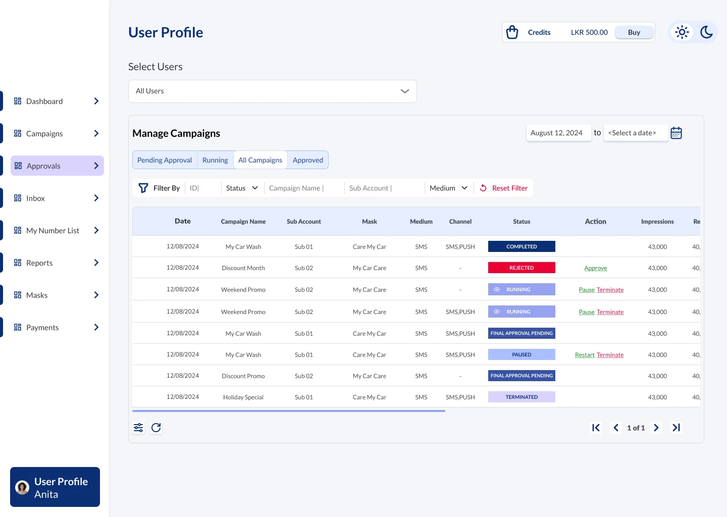
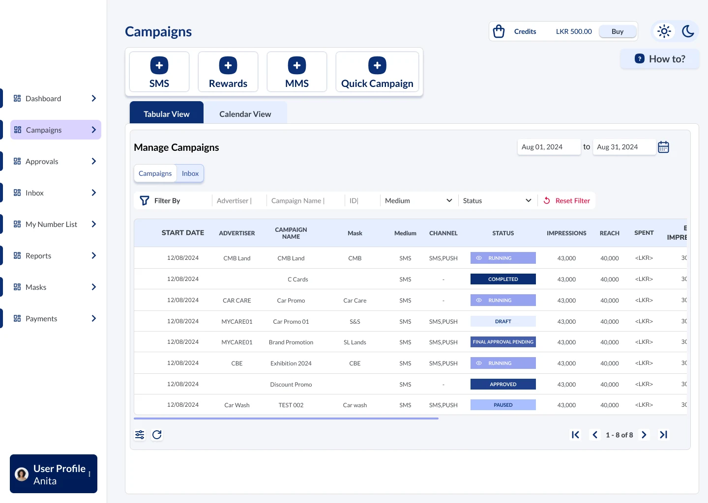
Manage campaigns table with status labels such as completed, rejected, running, final approval pending, paused and terminated, and pause, restart and terminate actions
Approvers manage every campaign under them, with clear statuses and actions.
Campaign approval window showing ad group details, a phone message preview, and a reject reason selected before rejecting or approving
Review with a live message preview; reject with a preset reason and a note.
Rejected campaign on the single-screen form, with the ad group marked rejected and a Reject Reasons button
A rejected campaign returns to its creator with the reason, ready to fix and resubmit.
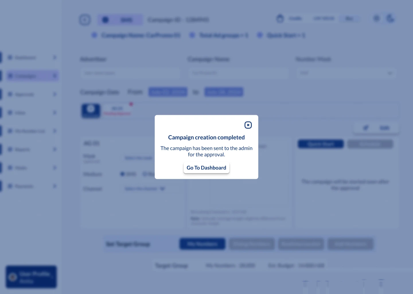
Confirmation pop-up: campaign creation completed, the campaign has been sent to the admin for approval
Submitted: the creator always knows where the campaign has gone.
Decision 2

One panel for every way of choosing an audience

The problem

A campaign's audience could come from four very different places: the client's own lists, the provider's wider network, people currently in a particular area, or a handful of numbers typed in by hand. The brief barely explained this, and each source needed different inputs.

The solution

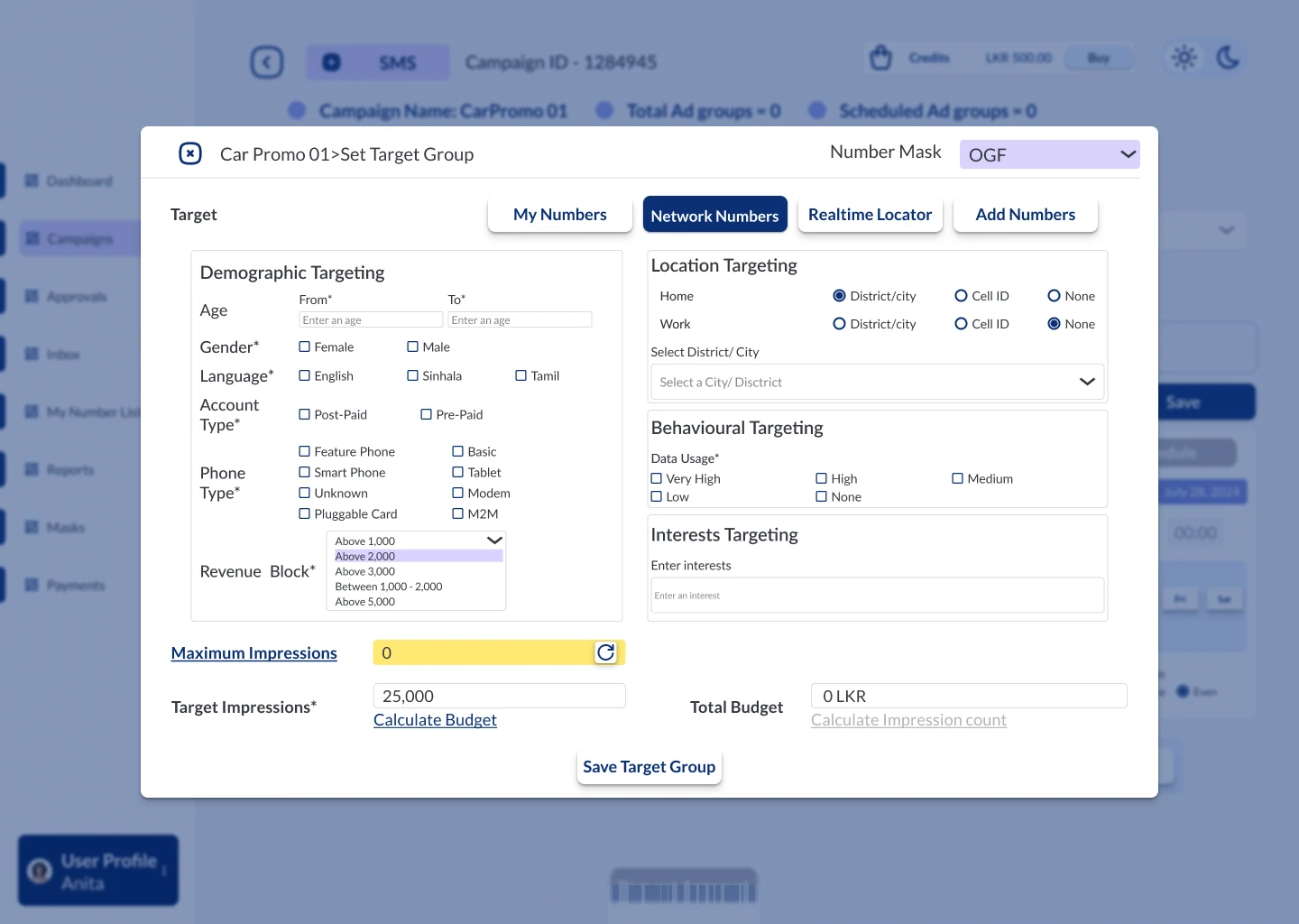
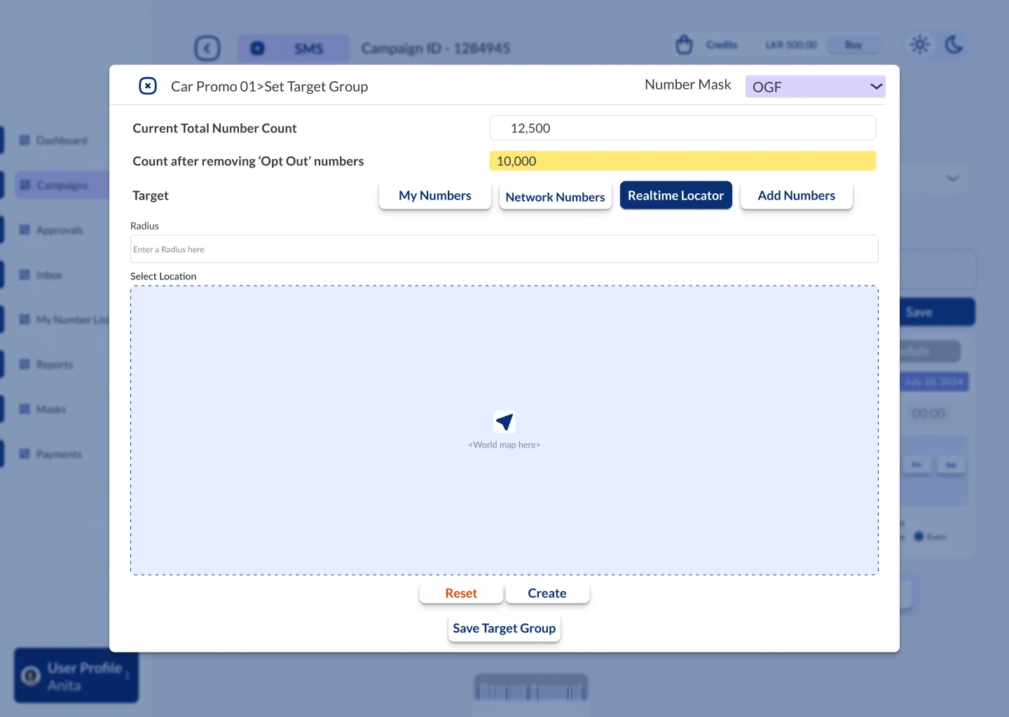
I put all four sources into a single "Set Target Group" panel for each ad group, with one tab per source. My Numbers uses saved lists, sending the same message to everyone, a different message per number, or a template. Network Numbers filters the wider audience by demographics, home or work location, data usage and interests, with a cap on impressions and a budget calculation. Realtime Locator reaches people within a chosen radius on a map, and Add Numbers takes pasted numbers.

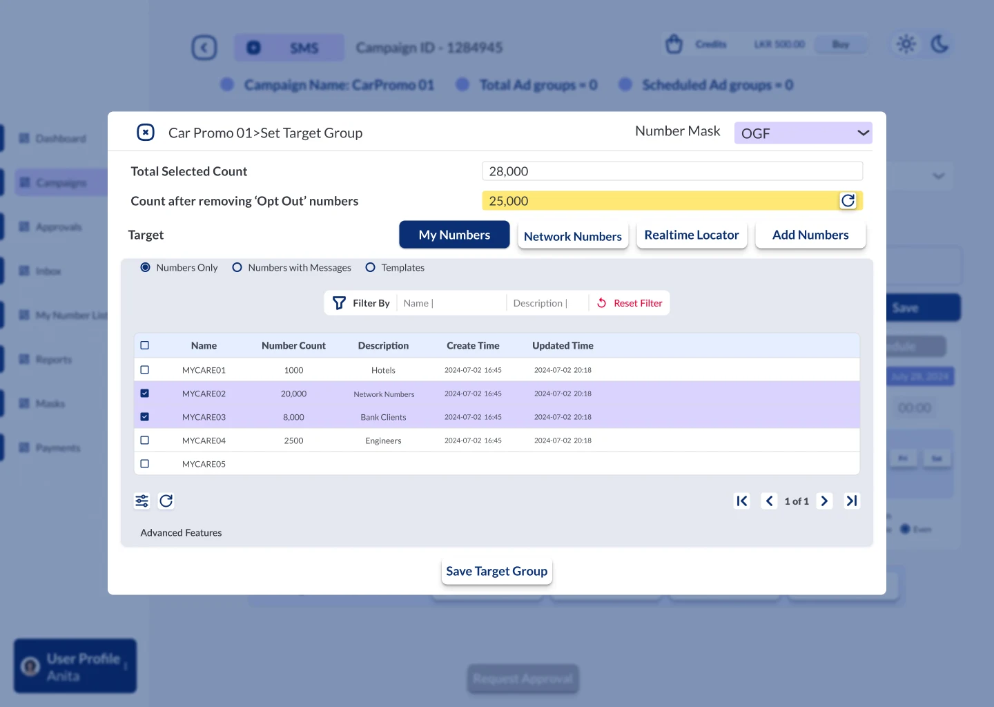
Whichever tab is open, the top of the panel shows the same three figures: the total selected, the count after removing people who have opted out, and the budget. A Budget Analytics popup breaks the cost down by message length, from a standard SMS up to 960-character "essay" messages. A confirmation warns the user if a selection would change the campaign's sender name, and switching tabs part-way through warns before a selection is lost. Behind these figures sits a rate card system in the admin console: a default system-level rate card, client-specific rate cards published with an effective date, and prices built from a base cost, targeting levels, time slot and number prefix adjustments, and discounts.

Why it works

Wherever the audience came from, users knew exactly how many people they'd reach and what it would cost before submitting. Opted-out numbers were removed automatically, provider admins could explain pricing, and VIP clients could see what they'd spend before committing credits.

Set Target Group panel on the My Numbers tab: total selected count, count after removing opted-out numbers, and a table of saved number lists
My Numbers: saved lists, with the same three figures always at the top.
Set Target Group panel on the Network Numbers tab with demographic, location, behavioural and interest targeting, maximum impressions and total budget
Network Numbers: demographic, location, behavioural and interest targeting, with a budget calculation.
Set Target Group panel on the Realtime Locator tab with a radius field and a map area
Realtime Locator: reach people within a radius of a chosen place.
Decision 3

Personalised templates

The problem

Repeat clients sent the same kind of message again and again, often personalised with names, addresses or account numbers, and retyping it each time was slow and error-prone.

The solution

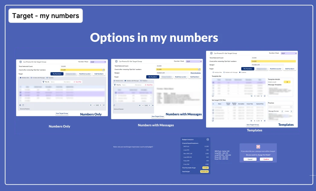
I designed templates that work like mail merge. The message has placeholders such as {name} or {account number}, and the uploaded recipient file has a column for each, with the first column always reserved for the phone number, so every person receives their own version of the same message. The template details show how many placeholders it expects, and the preview steps through real examples before submitting. Templates and recipient files live in My Number List, so they can be reused across campaigns.

Why it works

Repeat campaigns became faster to set up and less likely to contain mistakes, and the preview meant users saw exactly what each recipient would get before anything was sent.

Board of the three My Numbers modes (numbers only, numbers with messages and templates with a message preview), plus the Budget Analytics popup and the sender-name change confirmation
The three My Numbers modes, ending in templates with a message preview, plus the Budget Analytics breakdown and the sender-name warning.

05 — Handoff & Outcome

Built, ready, and handed over with its logic

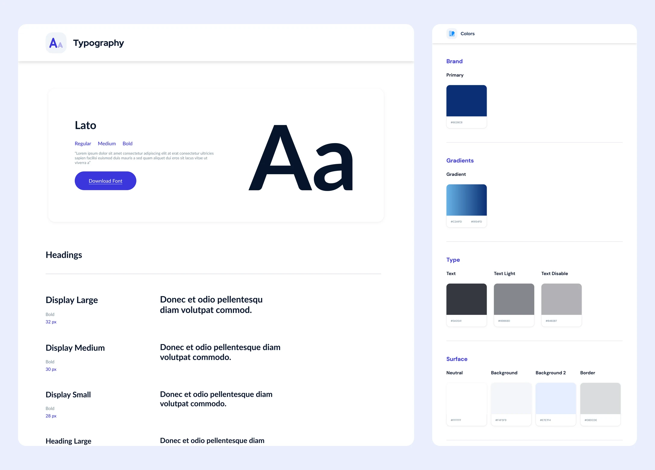
The interface is entirely in English. I chose Lato because its rounded, evenly weighted letterforms feel familiar to readers used to the rounded shapes of Sinhala and Tamil scripts, which makes English text easier on the eye. Type runs from 12 to 20 px in the product, with generous white space, in a single light theme suited to long working sessions.

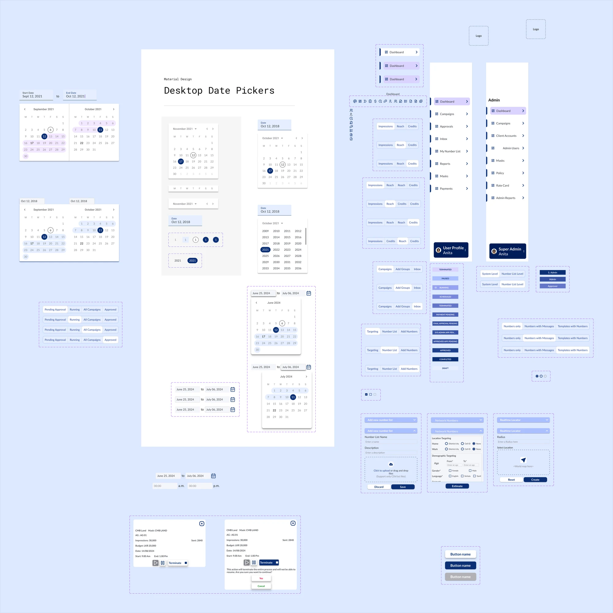
As the sole designer working with one frontend developer, two backend developers, a QA engineer, a DevOps engineer and two members of senior management, I handed over a Figma design system of colour and text styles, around 140 components, and a status label for every campaign state; reusable components for the trickier controls, including date and time pickers, audience selection and campaign selection; detailed annotations on every screen; and walkthrough sessions with the developers.

The platform was fully built and ready for launch: a complete replacement for an expensive foreign system, with a self-service portal for VIP clients, an admin console for accounts, pricing, policies and reporting, one flexible permission model, clear audience counts and cost breakdowns before every submission, multi-ad-group campaigns with flexible scheduling, and personalised templates. Launch was paused when the client exited the mass messaging market, so there is no usage data to report.

Component library page: date pickers, navigation for the user portal and admin console, tab sets, the full set of campaign status labels, targeting dropdowns and buttons
Part of the handoff component library, including the user portal and admin console navigation and a status label for every campaign state.

06 — Reflection

What I'd do differently

Get direct access early

The whole messaging flow started from one written sentence, which is why my first version had no approval step at all. Even one early session with the client would have caught that, saving my time and the developers'.

Settle the roles before the screens

It took several days of back-and-forth to agree the role model. Mapping the roles properly at the start would have prevented rework on both the design and development side.

Close the knowledge gap faster

For the first few days I didn't know what a number mask was, and in 2024 I had few tools to learn quickly. Today I use AI-assisted research to analyse requirements and understand domain concepts before I start designing, as I did on the stock brokerage platform.

Showcase

A closer look

01

User portal

Where provider staff and VIP clients run their campaigns, from a dashboard of reach and spend to delivery reports.

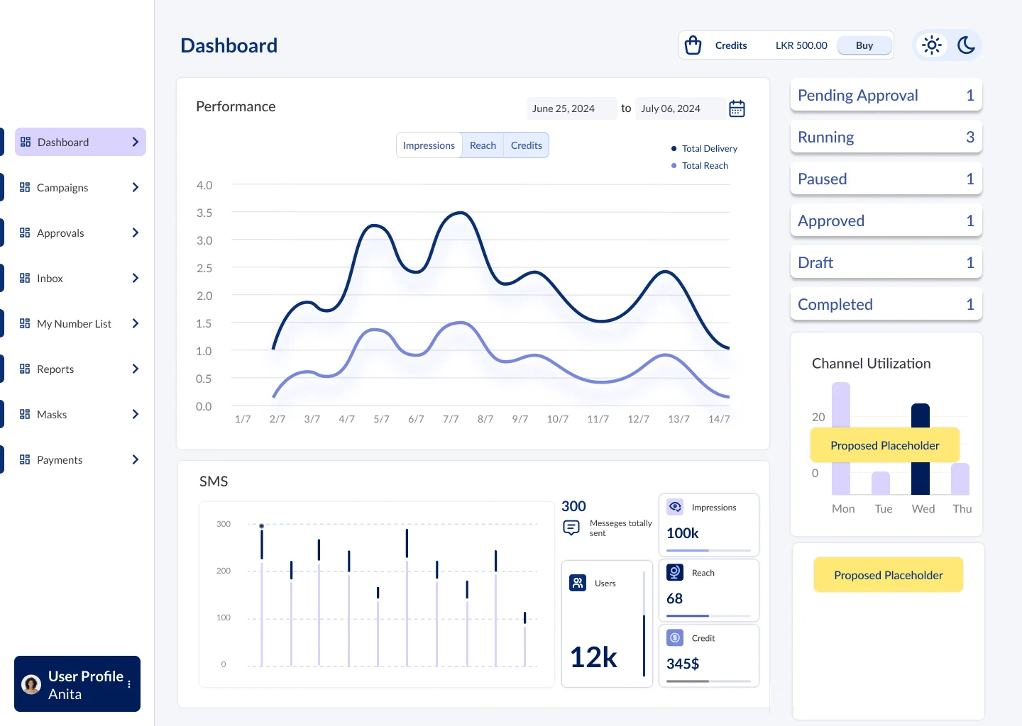
Dashboard with a performance chart of impressions, reach and credits, campaign status counts and SMS statistics
Dashboard
Campaigns in table view with advertiser, campaign name, mask, medium, channel, status and impressions
Campaigns: table view
Campaigns in calendar view, with today's running campaigns on the left and scheduled ad groups across the month
Campaigns: calendar view
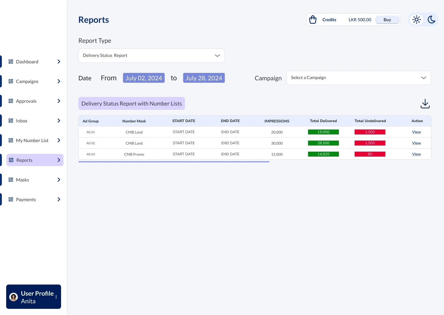
Delivery status report listing ad groups with delivered and undelivered totals
Delivery status report
02

Visual language

Lato for its familiarity to Sinhala and Tamil readers, a deep navy brand colour with soft blue surfaces, and one light theme for long working sessions.

Typography page showing Lato and the heading scale, beside the colour page with brand, gradient, text and surface colours
Typography and colour
Component library page
Components and status labels

Next up

More work on the home page

View all projects