Fresh but familiar: redesigning the OMS for advisors who didn't want change
The problem
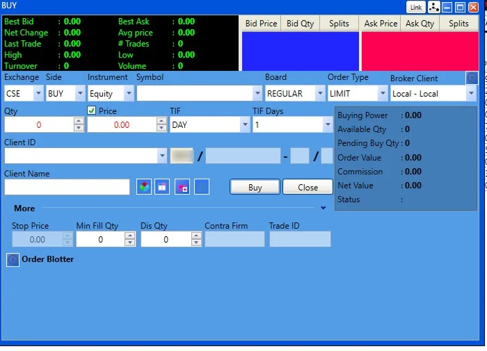
Advisors had used the old OMS for years and wanted the new one to behave exactly the same, while the client wanted a modern platform that could compete. Copying the old system would fail the client; ignoring advisors' habits would mean they rejected the new one.
The solution
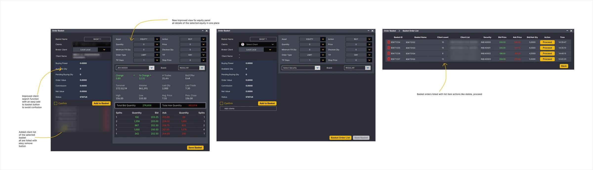
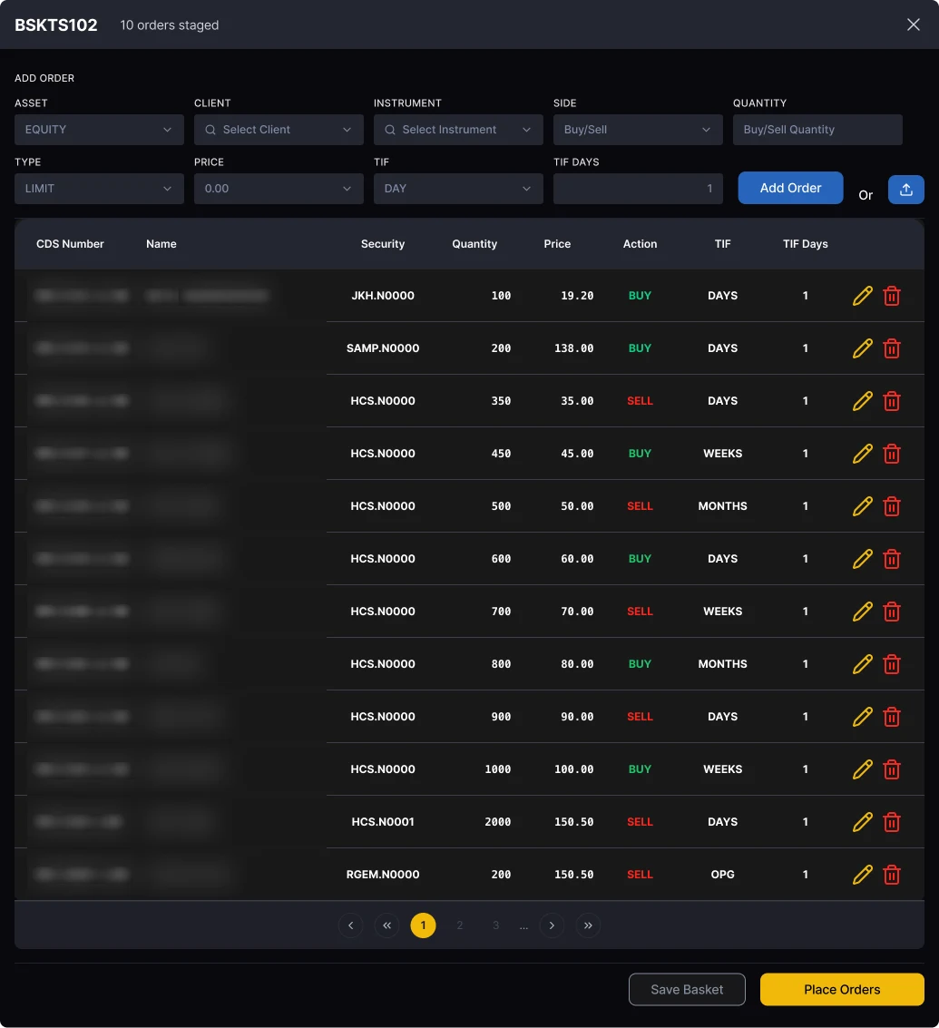
I weighed three options: copy the old system closely, which was safe but would carry over the clutter that made it worth replacing; build a completely new experience, which was clean but would break habits advisors relied on all day; or keep familiar behaviour with fresh visuals. I chose the third.
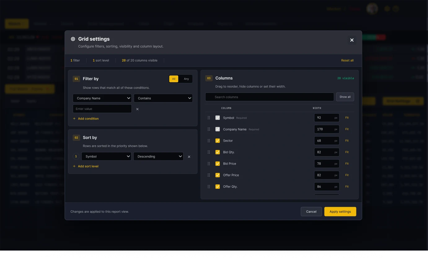
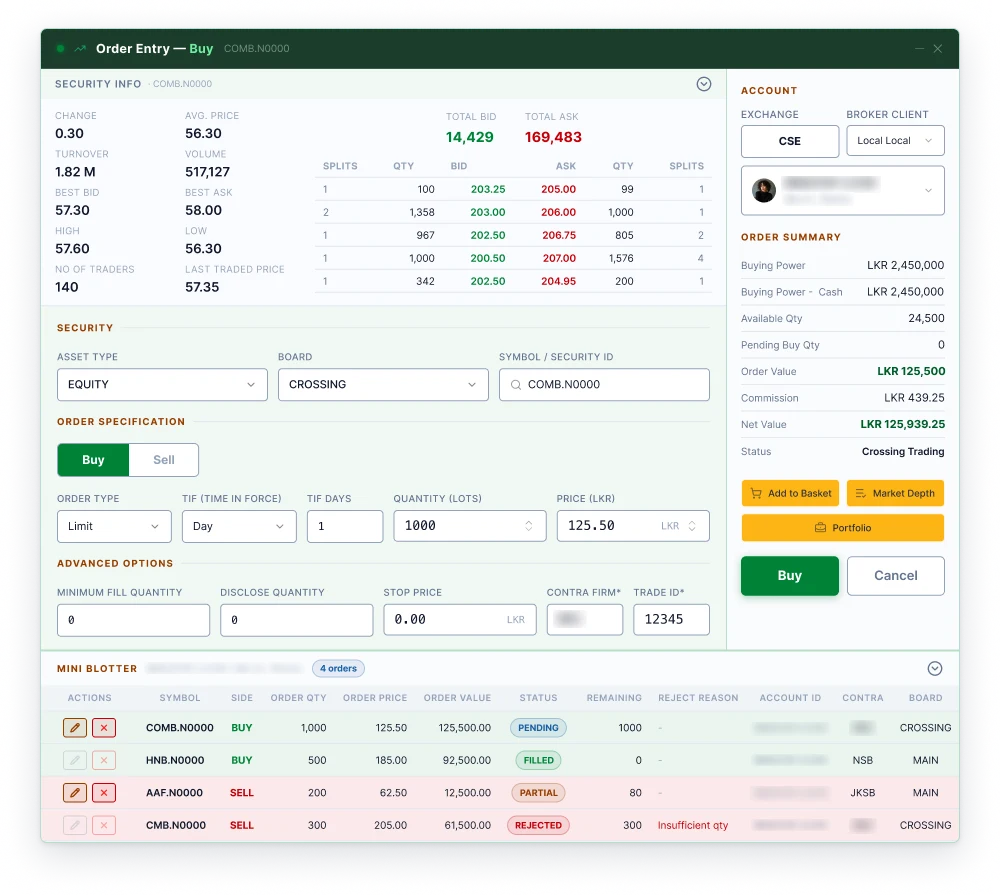
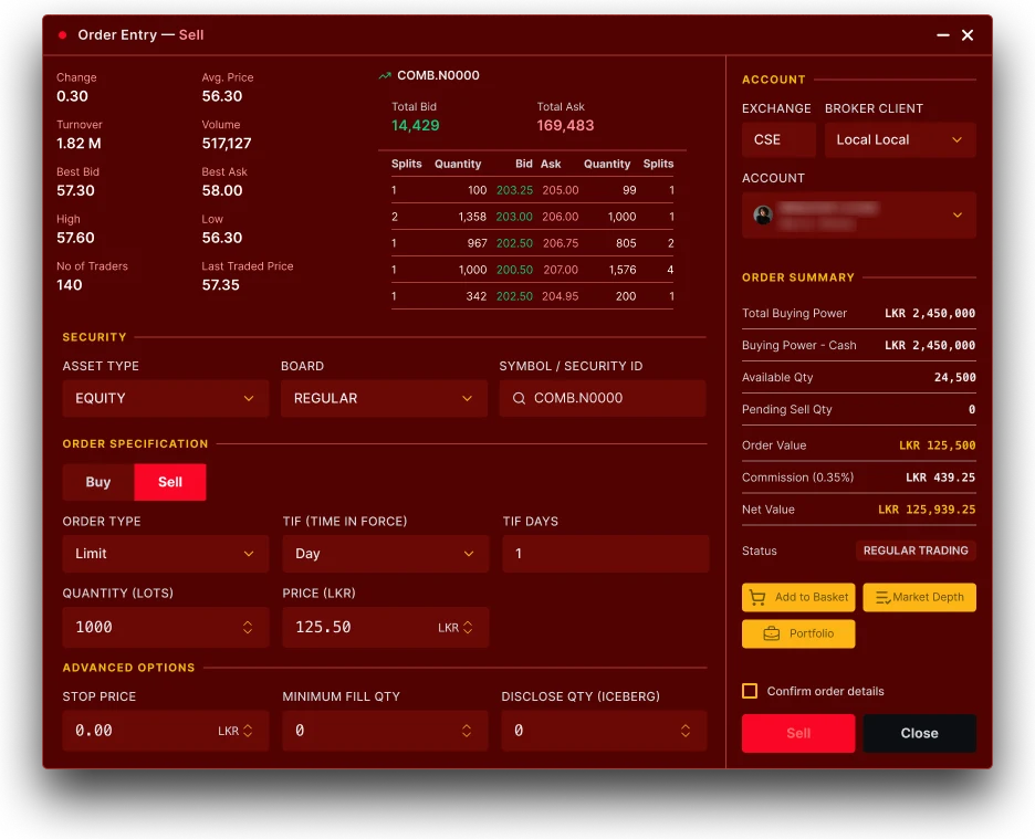
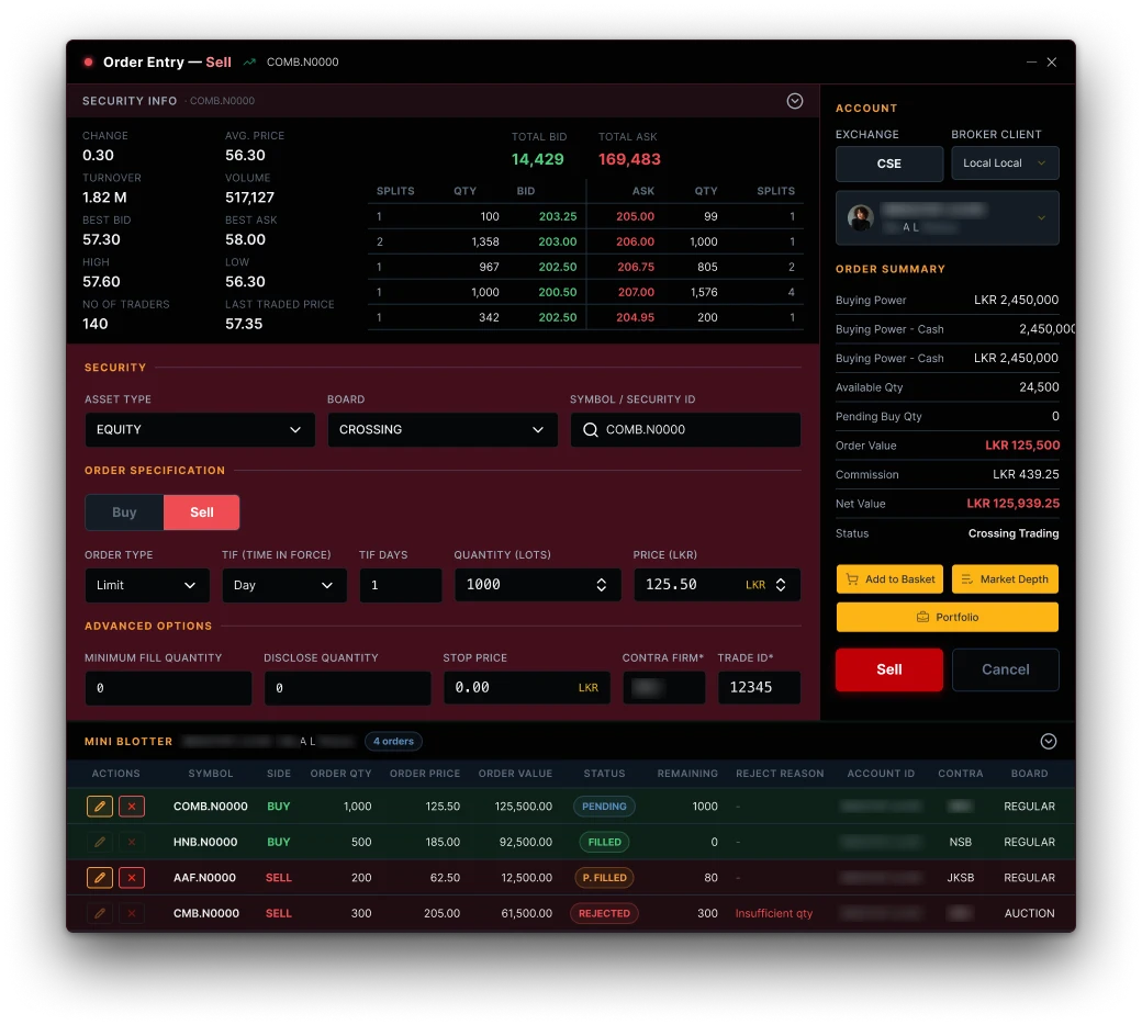
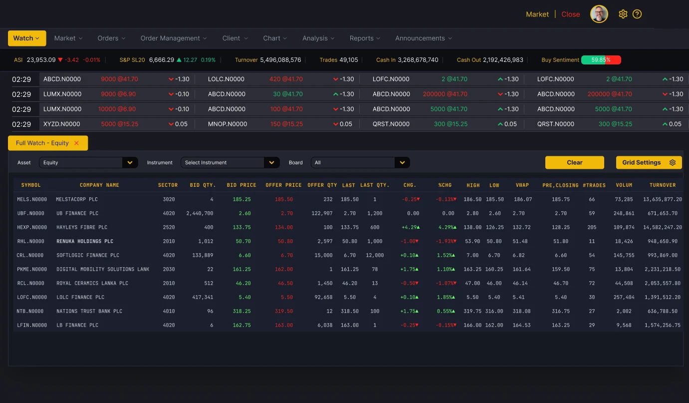
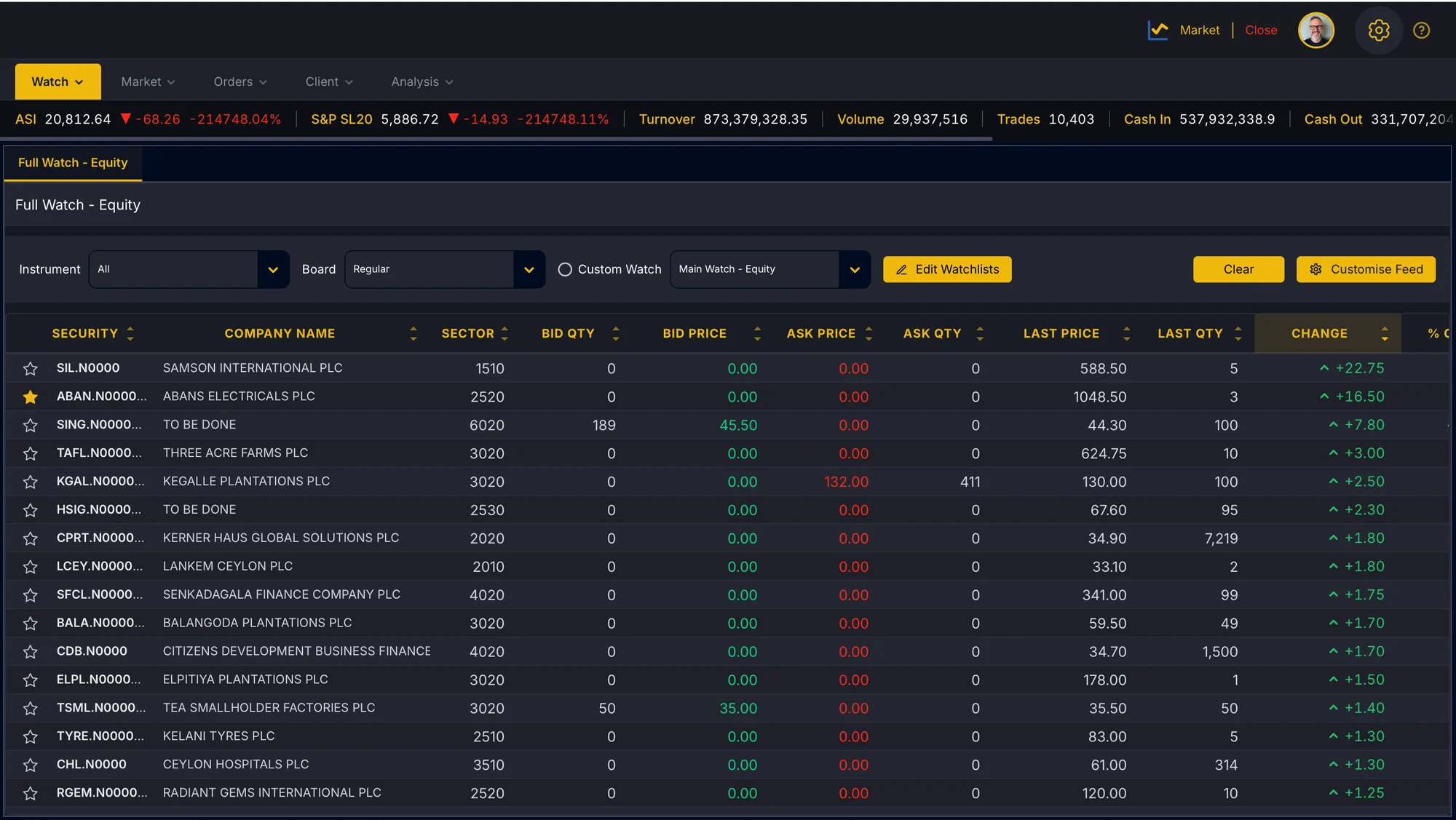
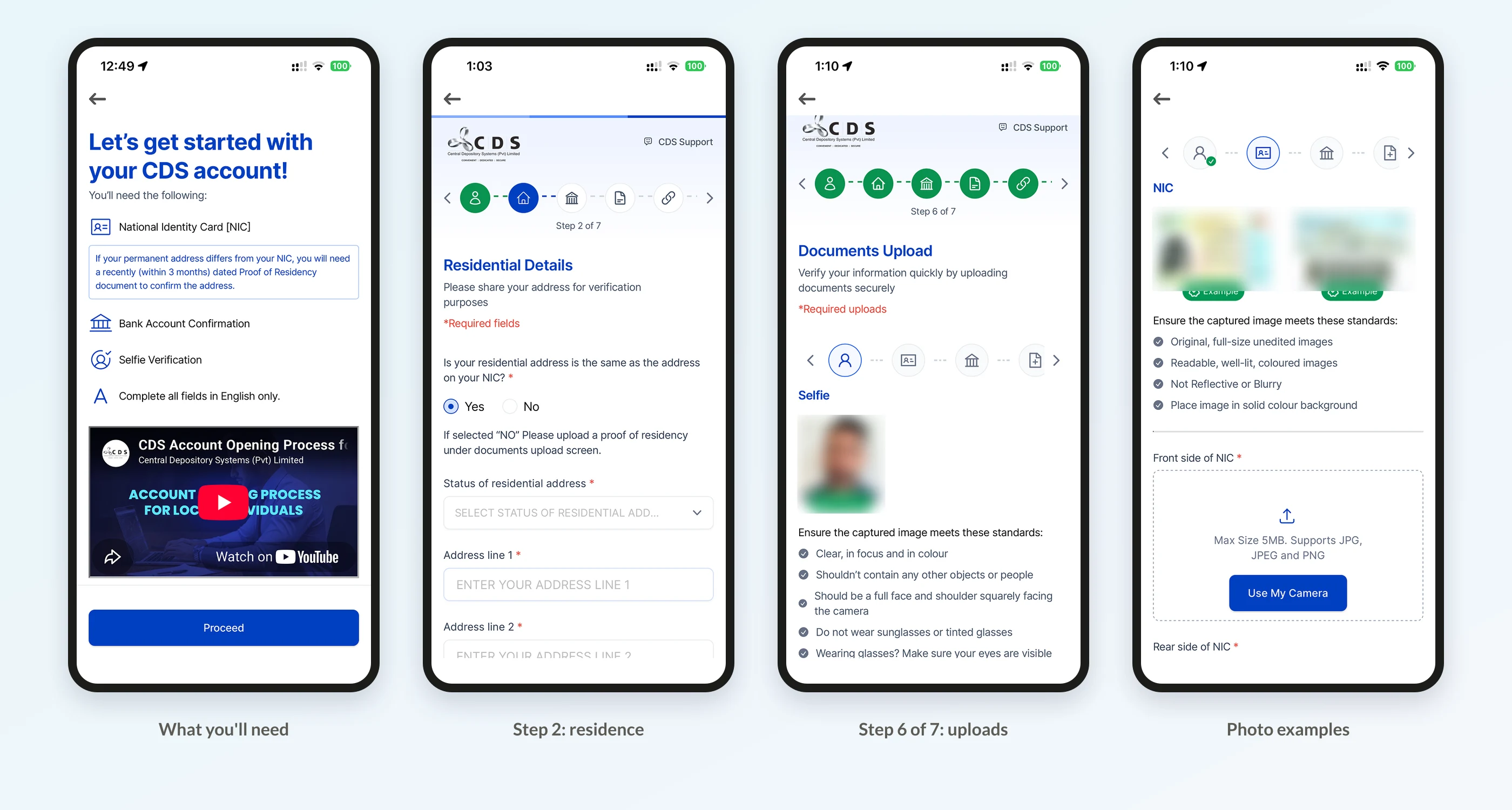
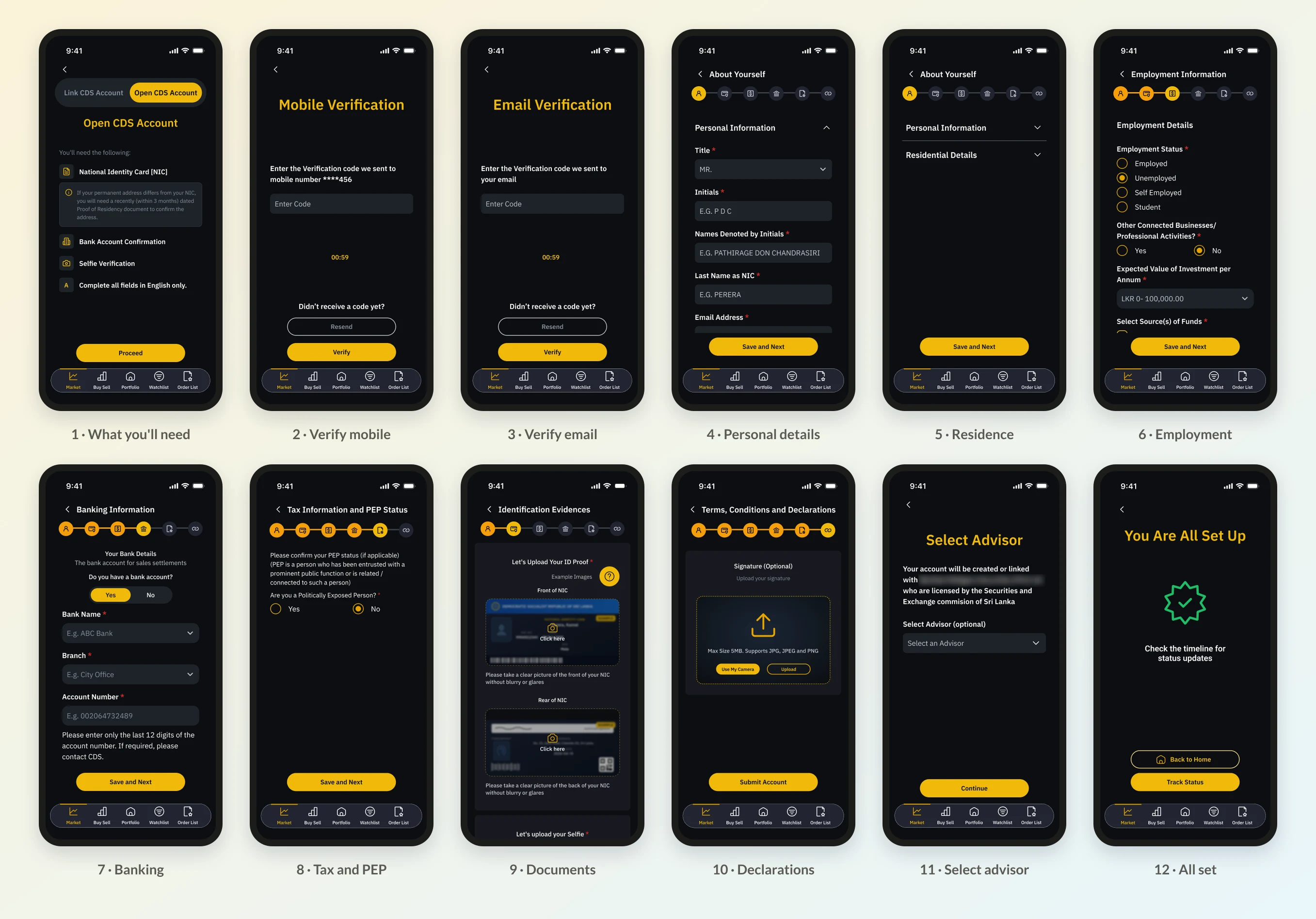
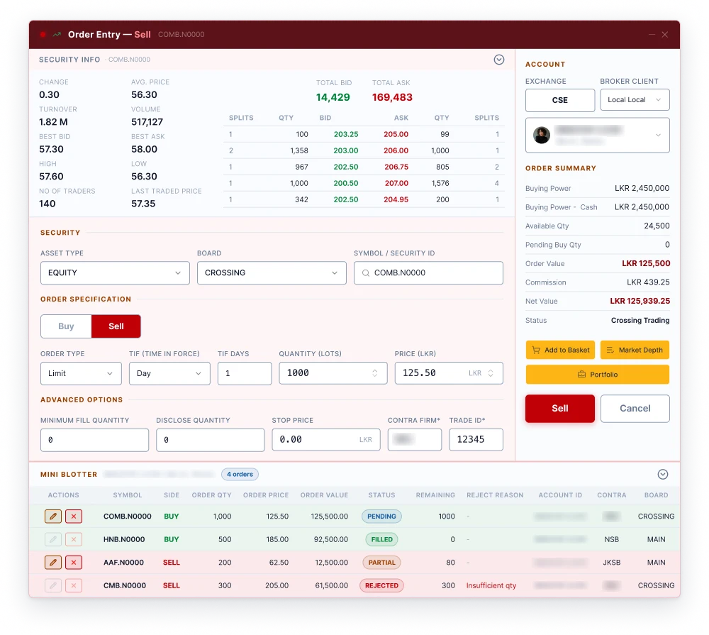
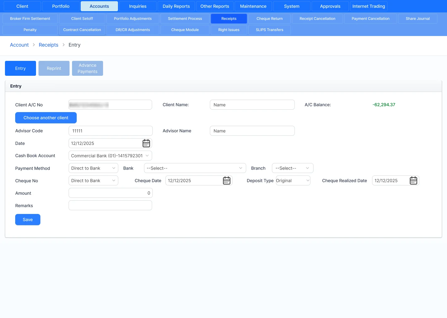
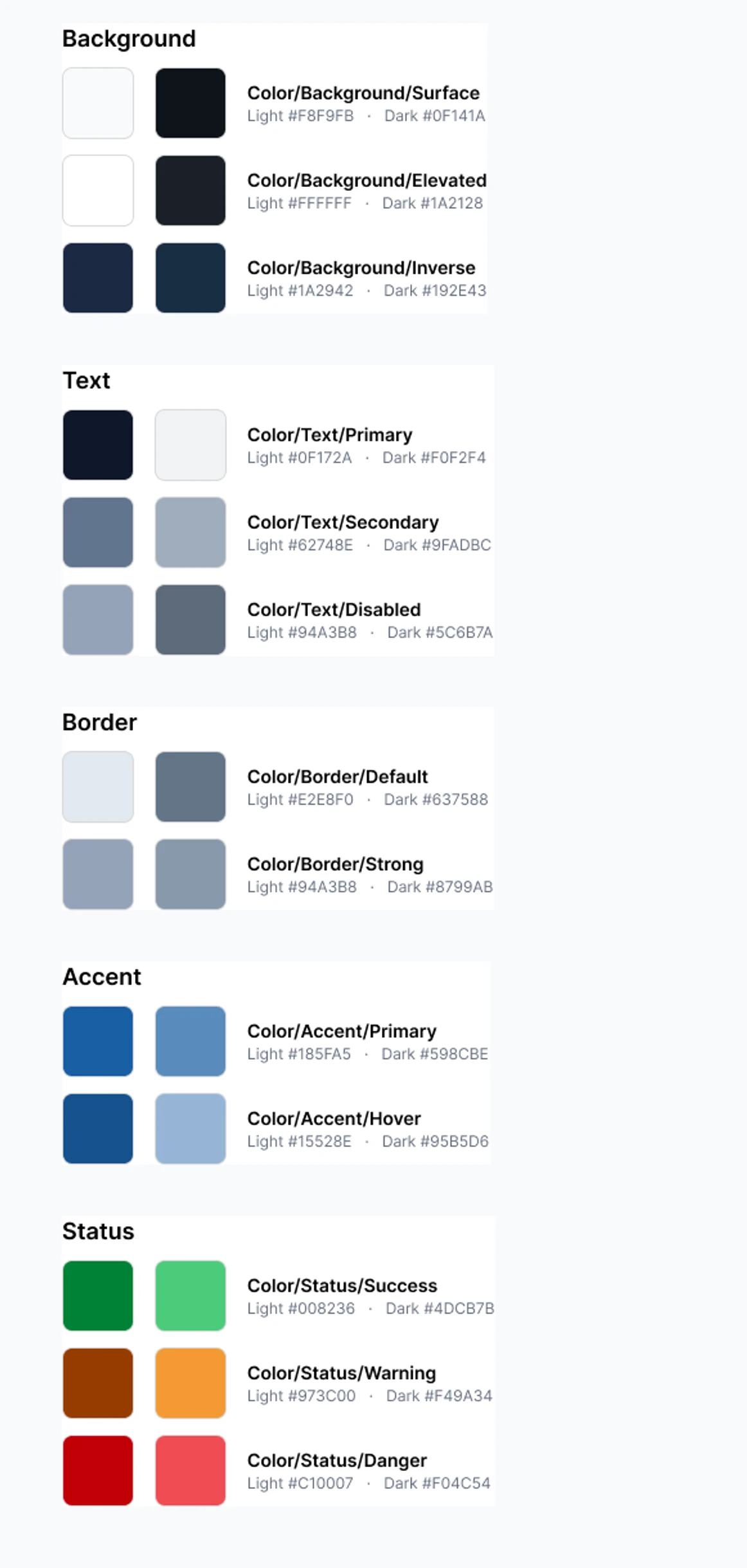
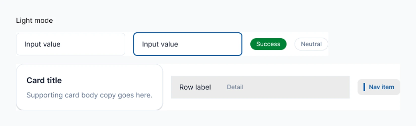
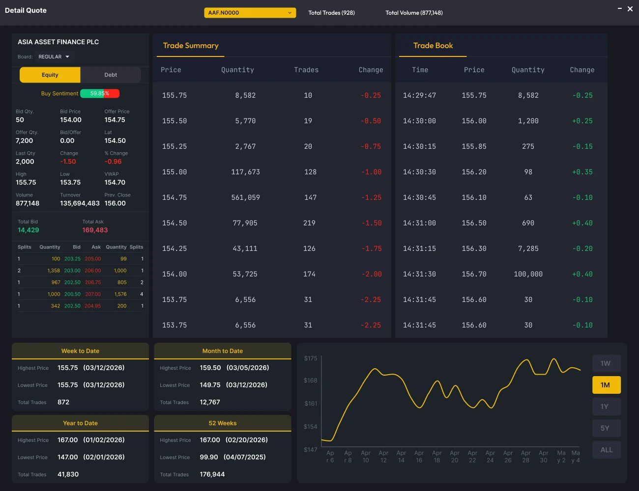
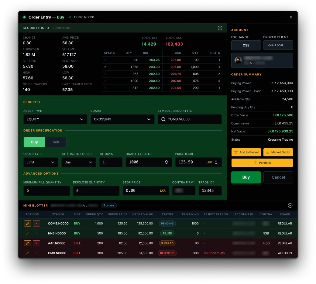
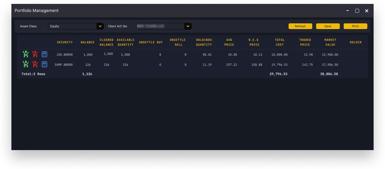
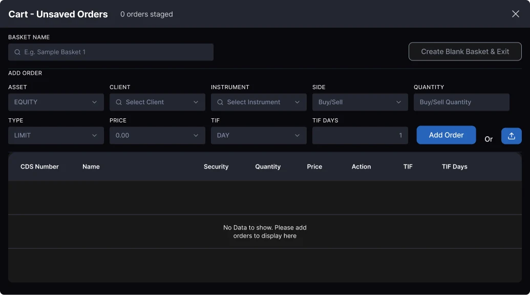
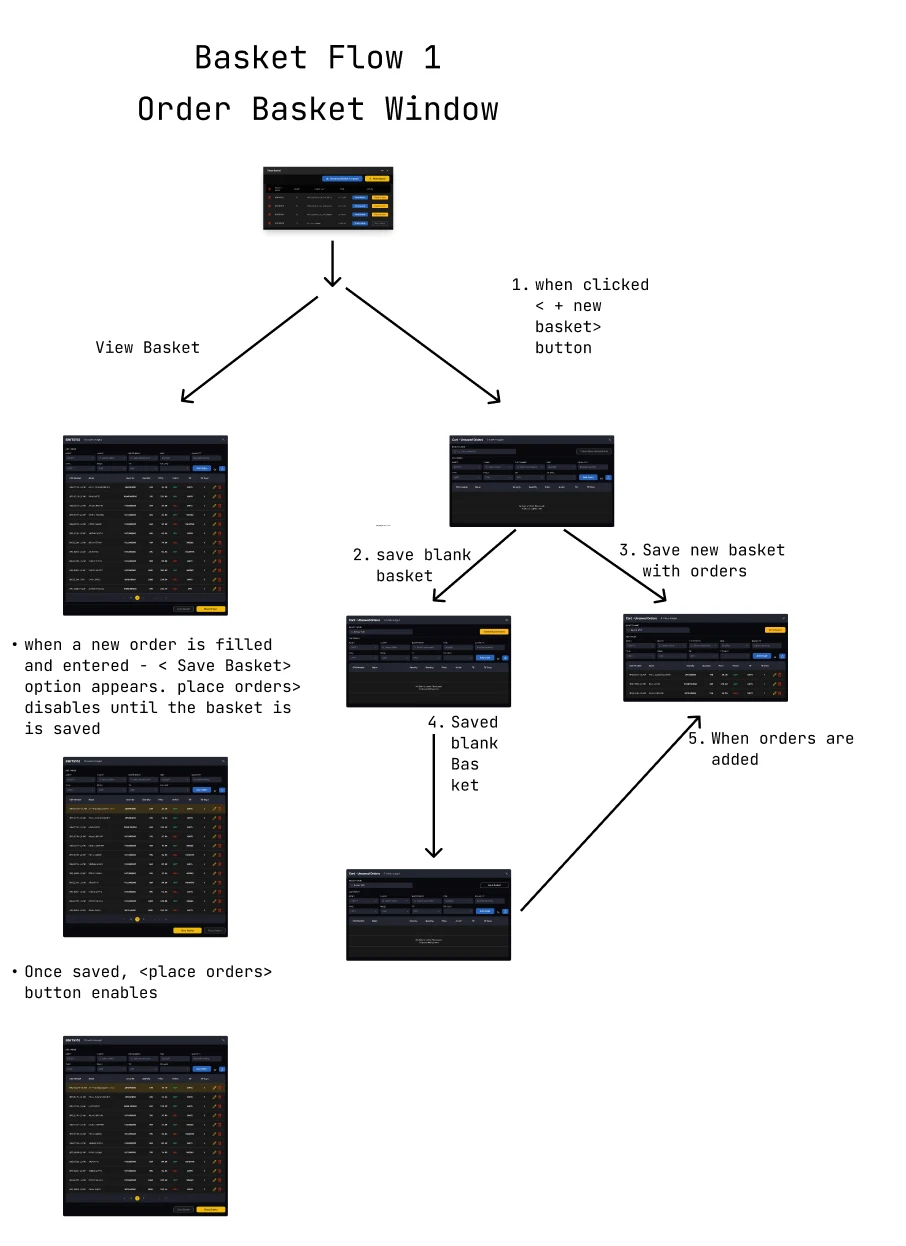
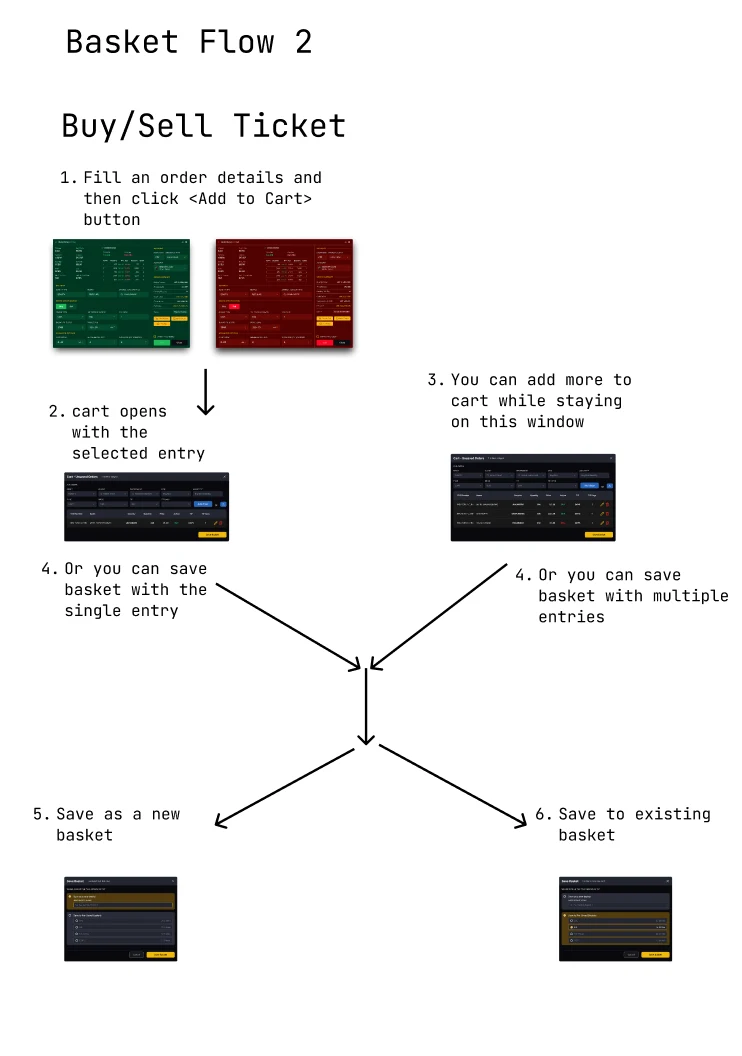
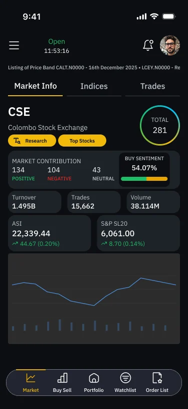
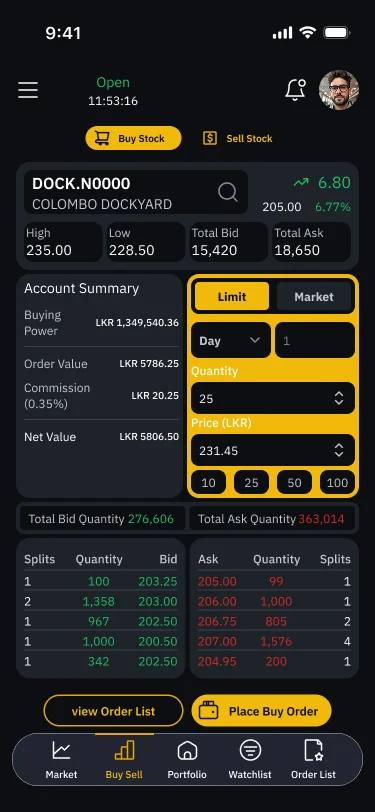
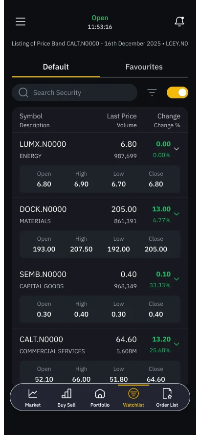
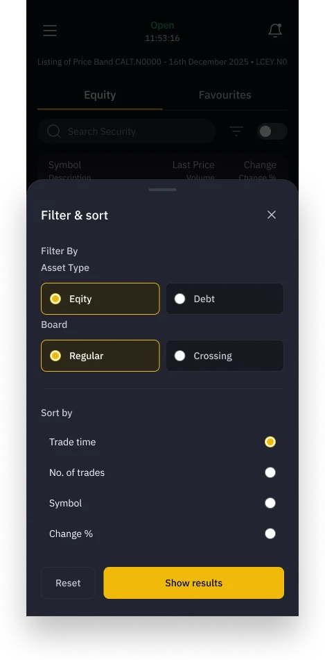
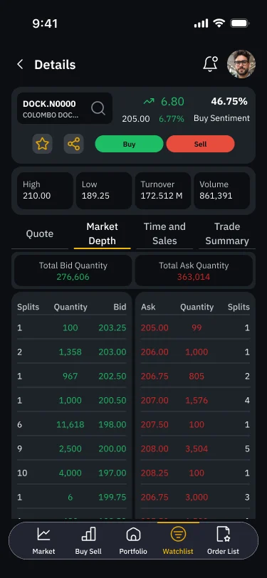
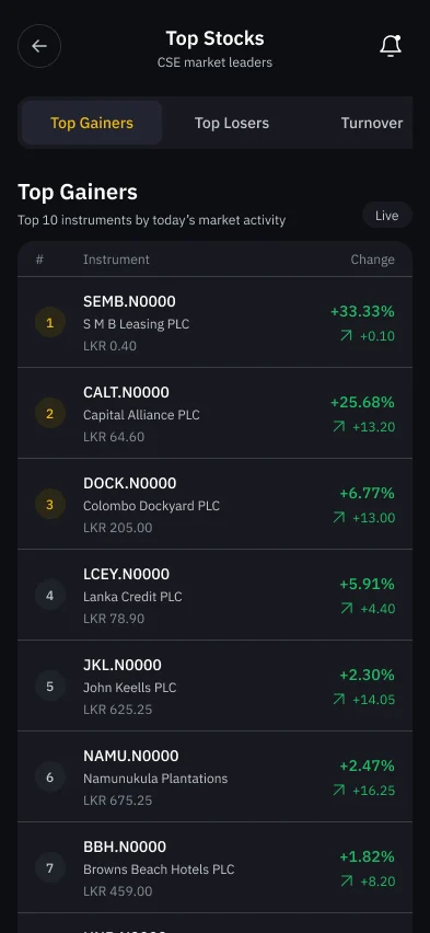
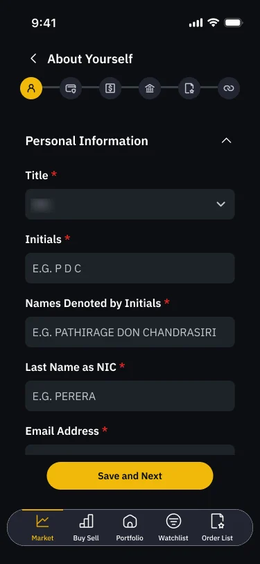
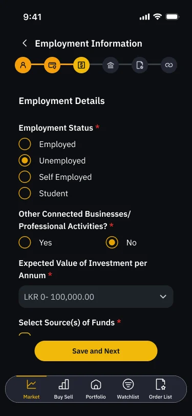
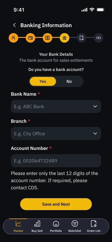
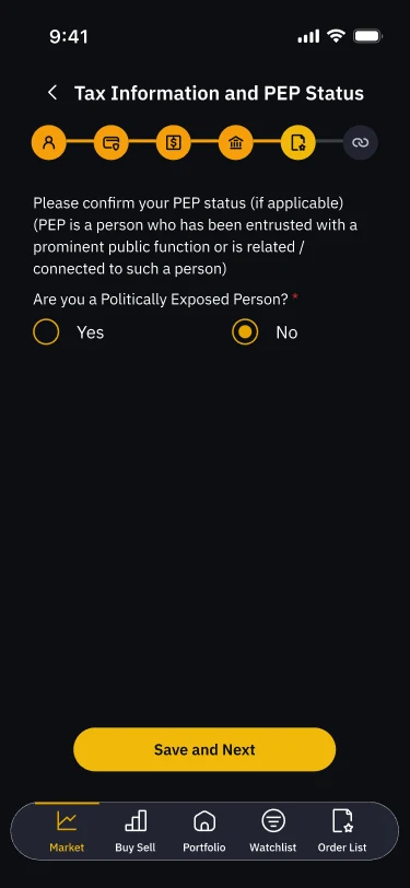
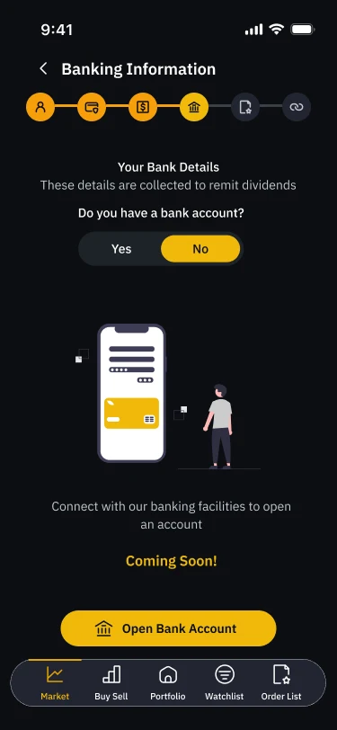
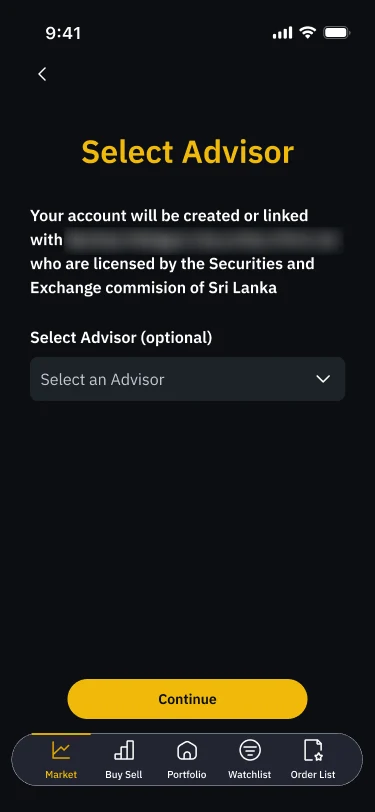
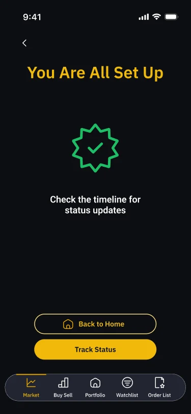
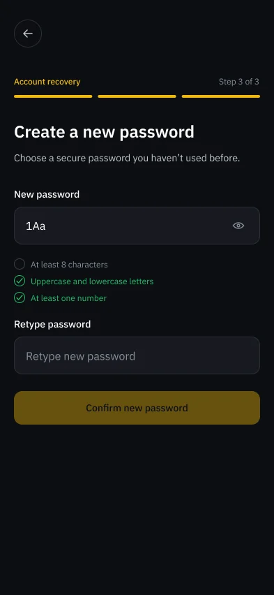
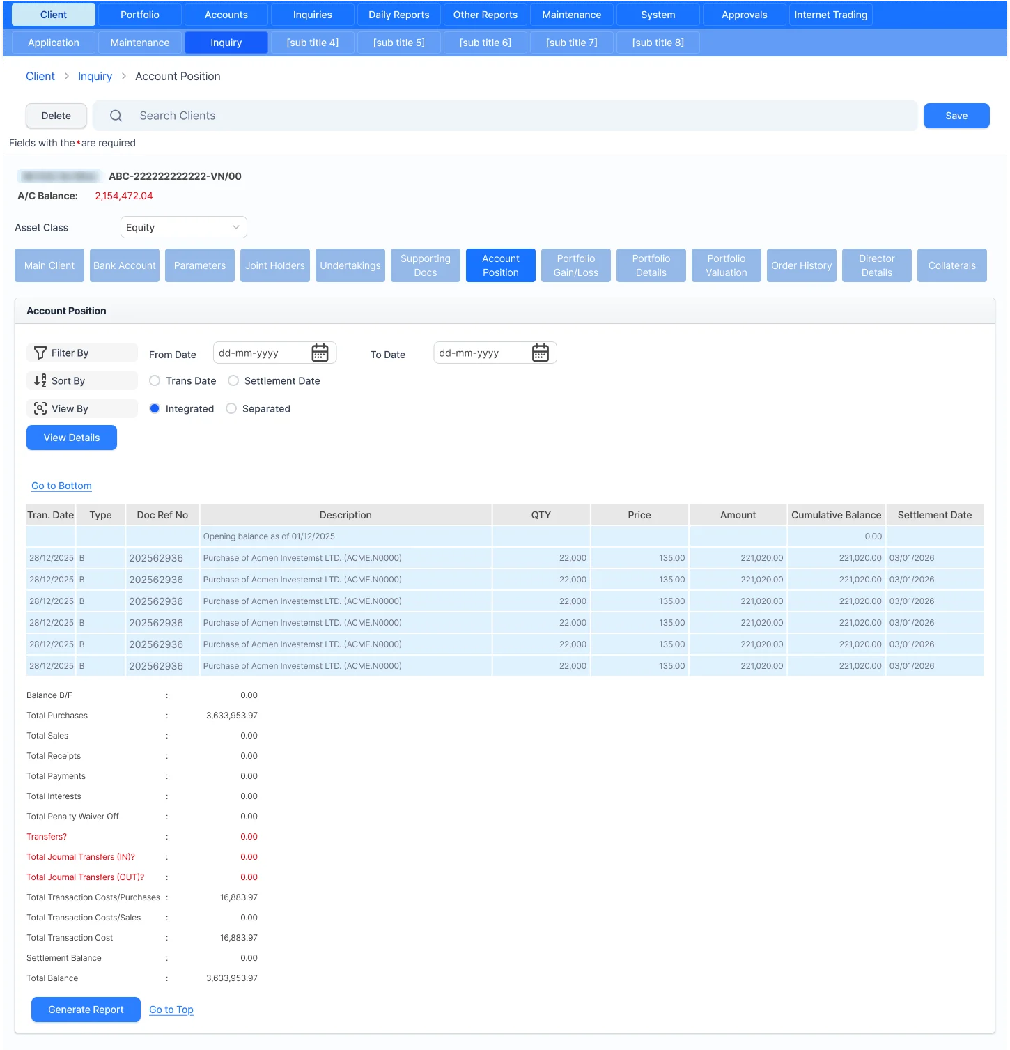
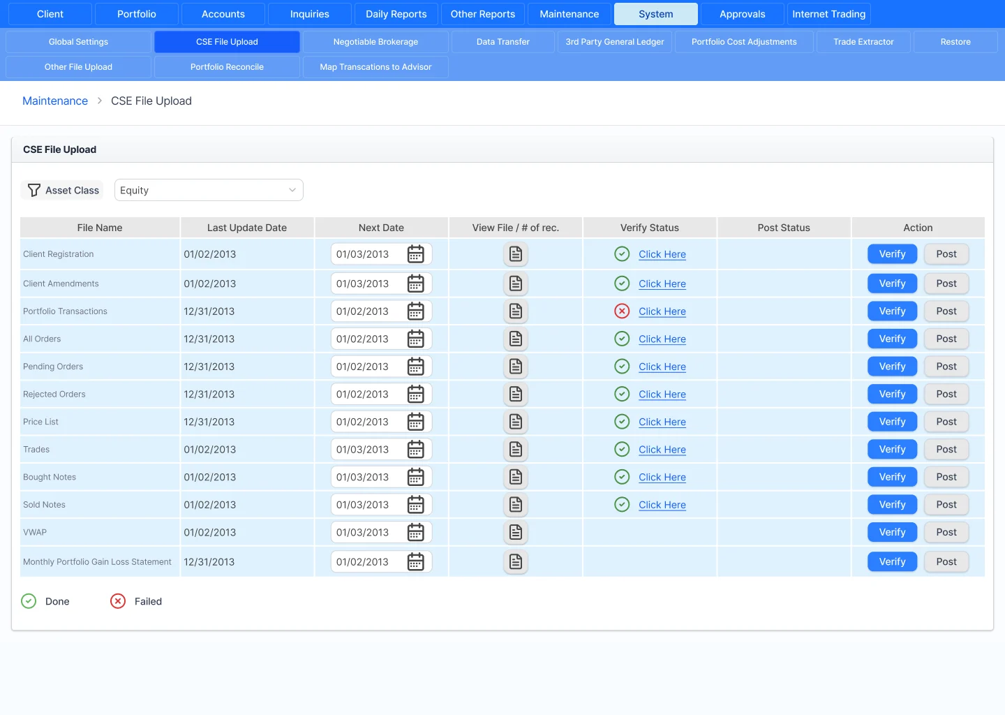
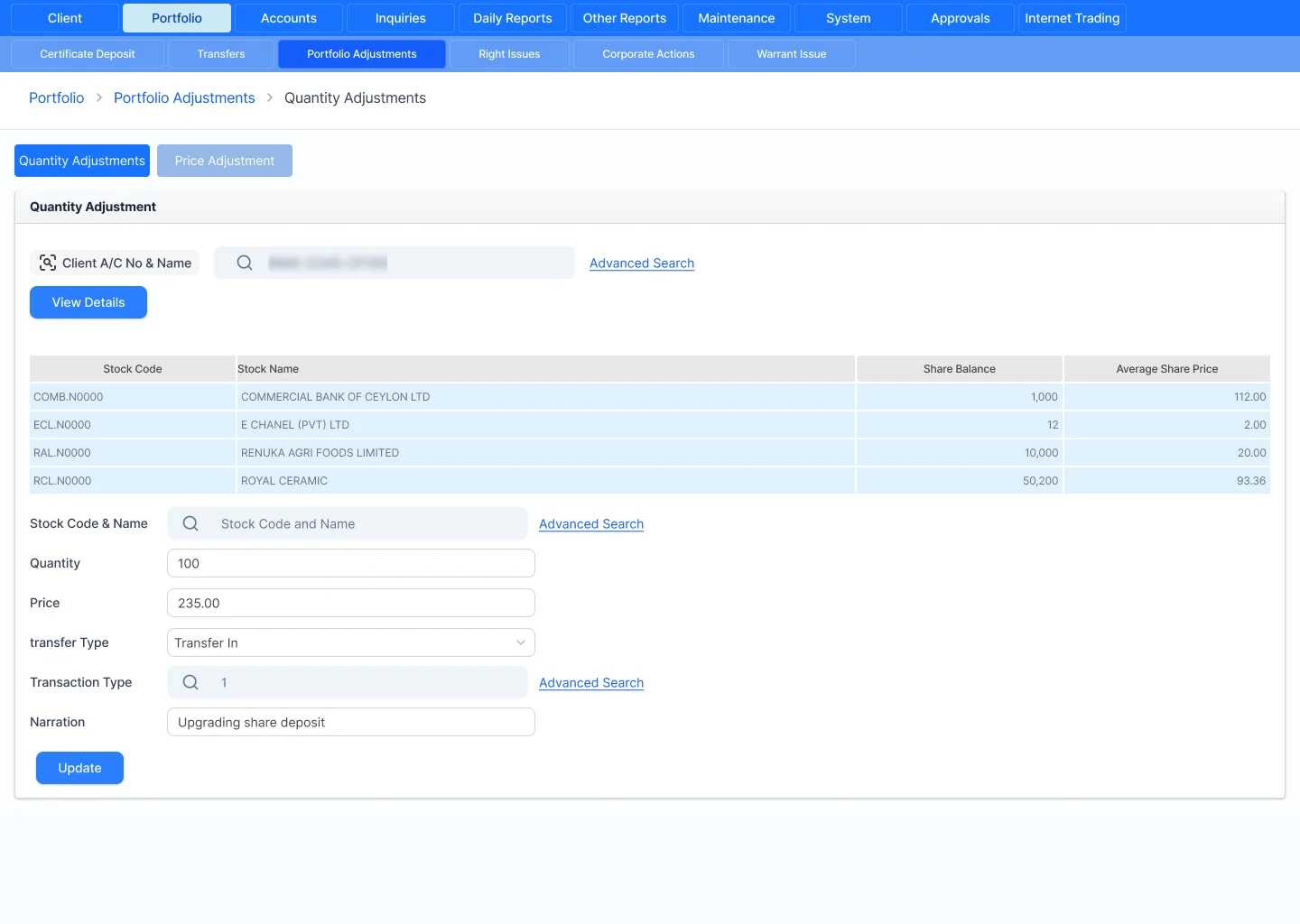
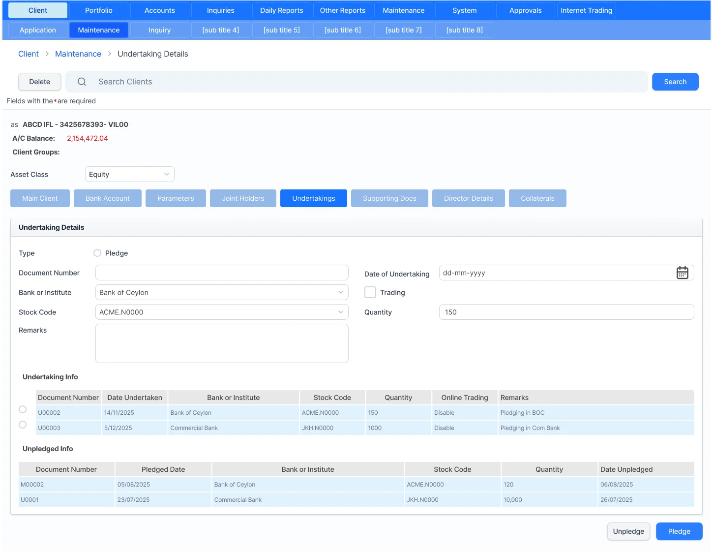
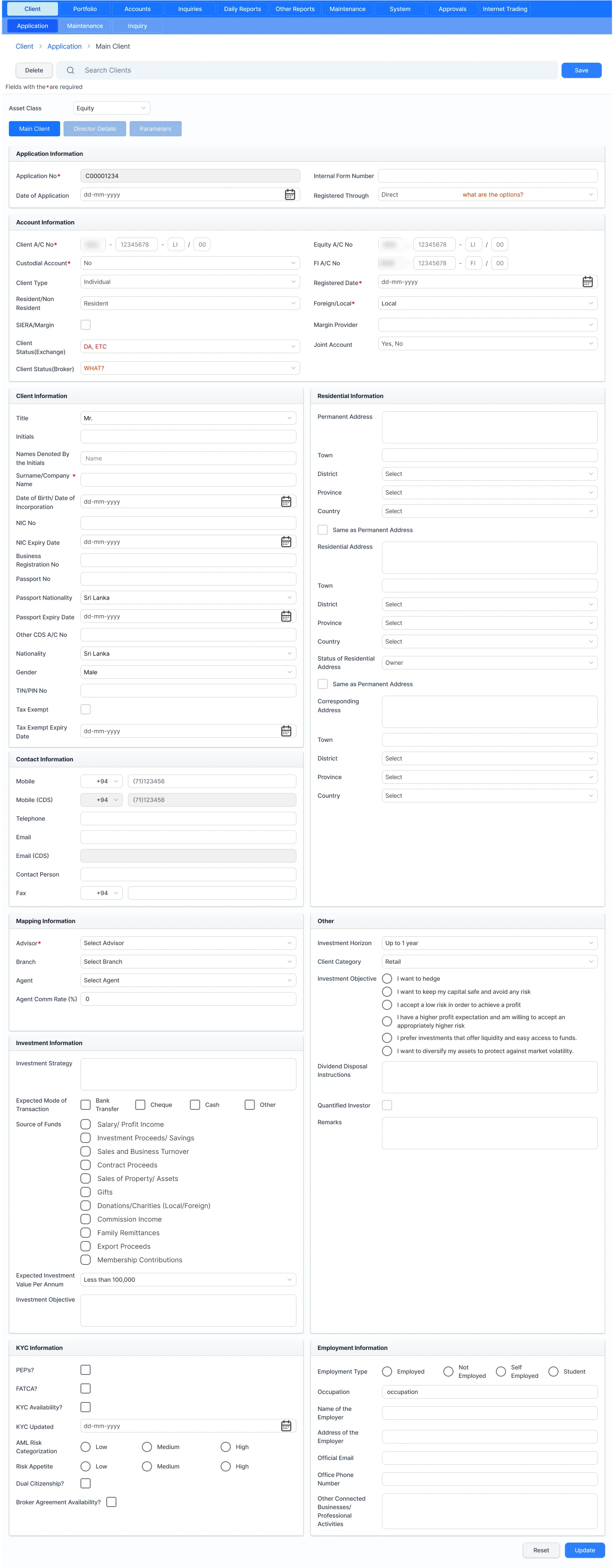
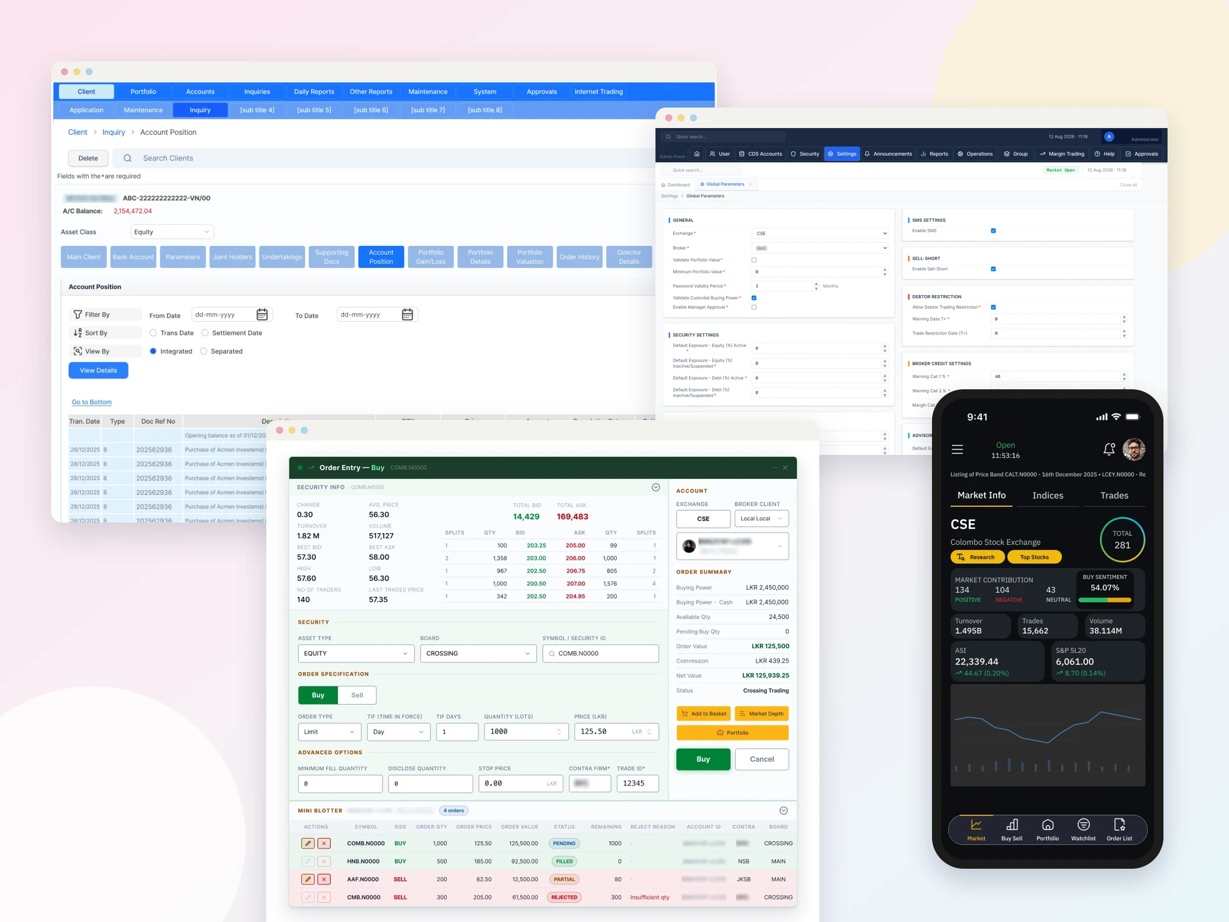
Desktop power came across to the web: right-click menus, snap-to-grid layouts and built-in table settings, even though developers had to research how to build them. Because advisors spend their whole day in data tables, and the old system made them resize columns every time they logged in, I designed one central grid settings control, available on every screen, to sort, filter, reorder and resize columns, with each layout saved to the user's account. For buy and sell, rather than colouring whole windows as the old system did, I kept the order window background neutral (white in light mode, black in dark mode) and used green and red only where users enter order details, with the intensity tuned for each theme. The mobile app doesn't need that treatment, so it uses one unified design.
Why it works
Advisors judge a new tool by whether it slows them down. Keeping their working patterns removed that risk and gave me room to change the visual design. On my most recent visit, advisors were happy with the new buy and sell windows and showed a clear preference for the light theme.